
Roles
UI Design
UI Design

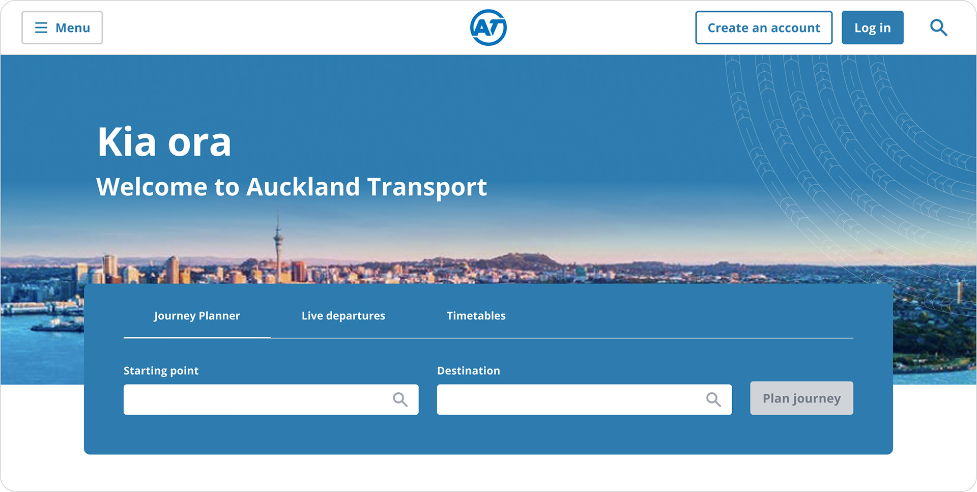
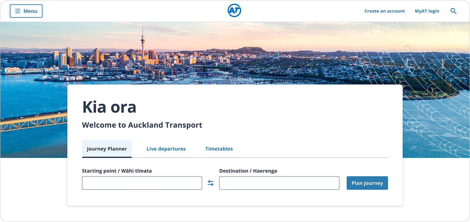
The old homepage
The existing homepage performed well, with users satisfied with its functionality. However, it used outdated branding, prompting further UX exploration to identify potential new features.

UX Design
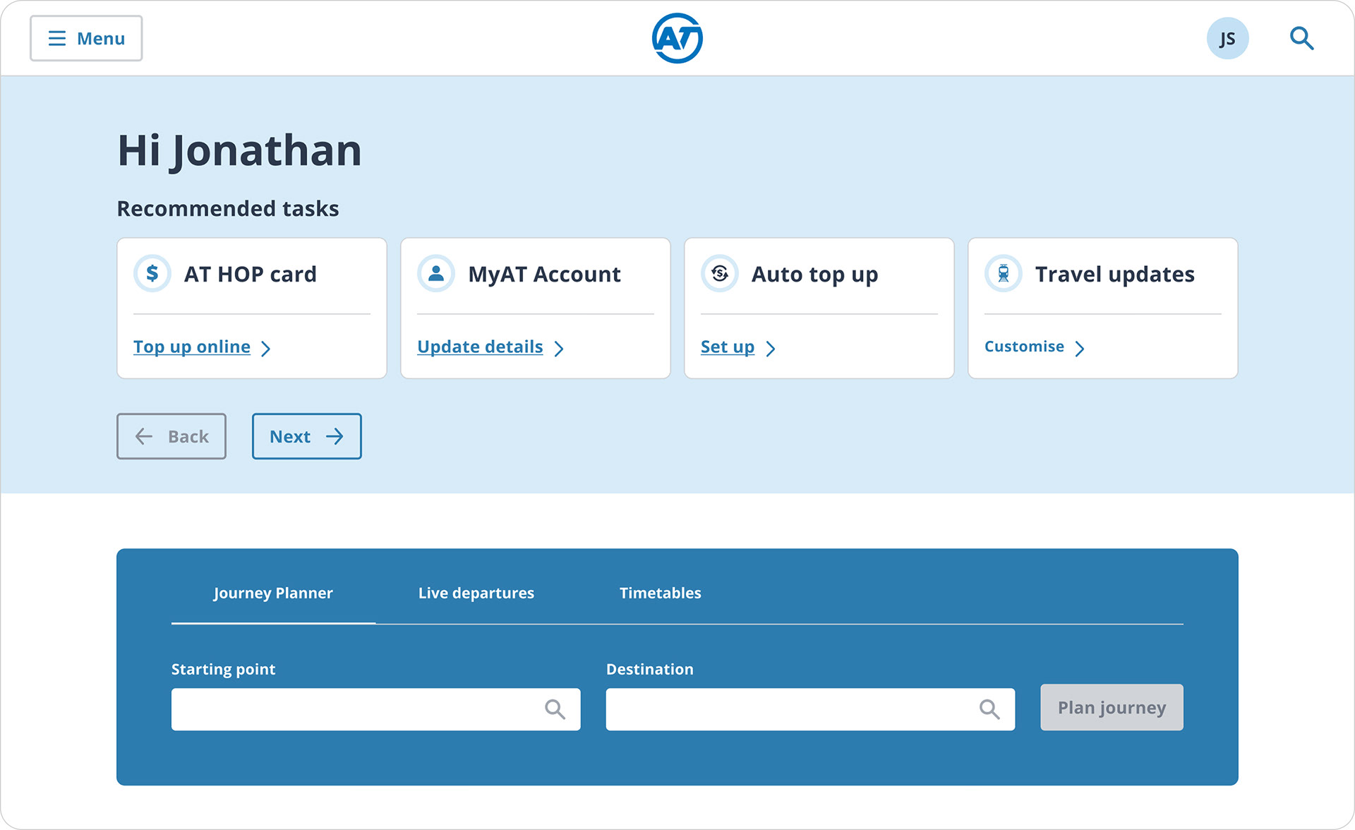
The UX designer came up with a few different wireframes, then did very high fidelity design so that they could use these designs for user testing.
From the options provided, all users preferred the version with the Auckland cityscape in the hero section. However, they were confused by the change to the homepage once they were logged in; they felt like they were in an account page, not the homepage.
From the options provided, all users preferred the version with the Auckland cityscape in the hero section. However, they were confused by the change to the homepage once they were logged in; they felt like they were in an account page, not the homepage.

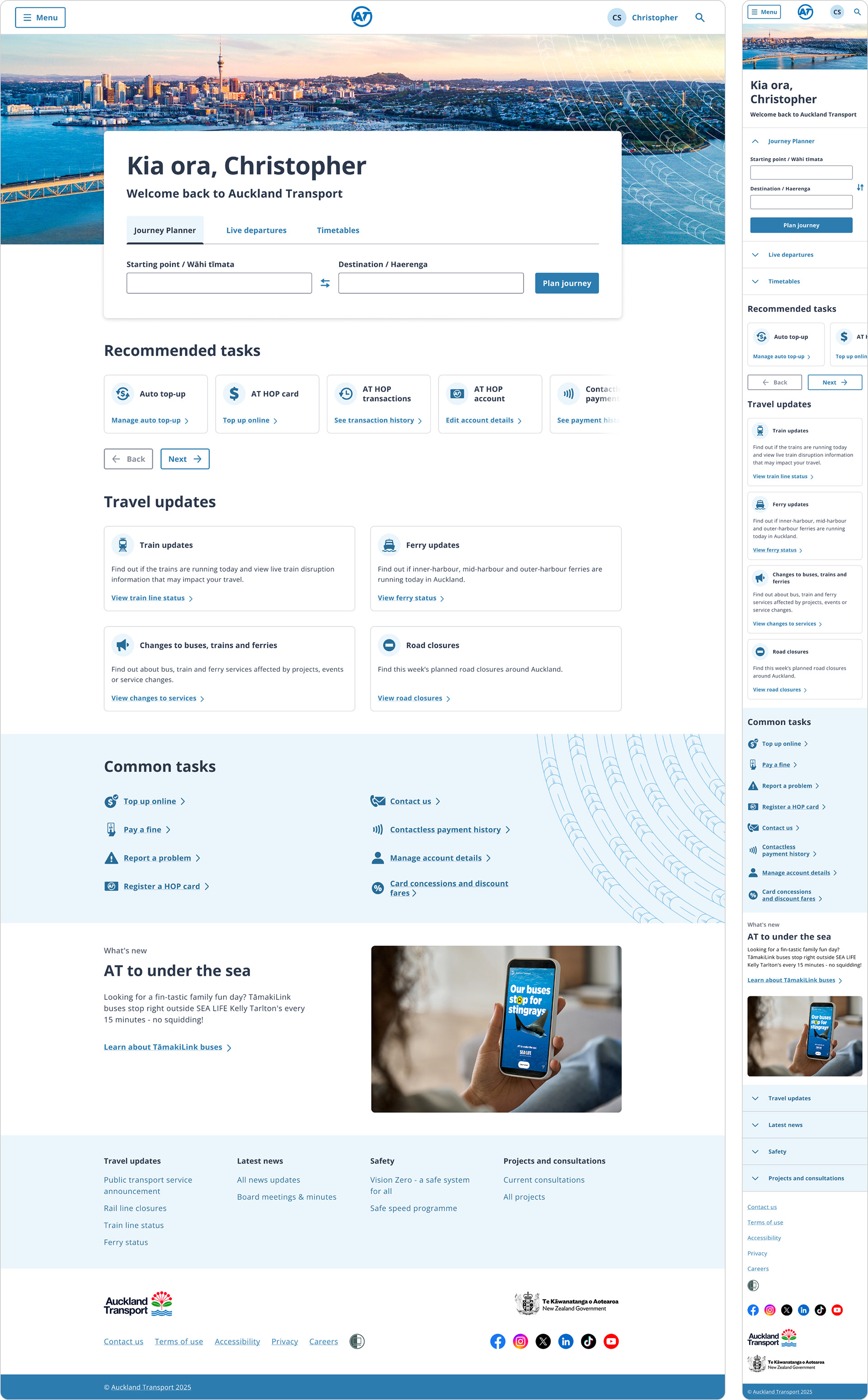
From UX to UI Design
After the UX designer completed their process, my role as the UI designer was to incorporate user feedback they acquired and ensure the design system was applied correctly, WCAG guidelines were met, and the design was in alignment with brand standards.
See the before and after screenshots below, where I elevate the designs based on the user feedback and my design experience.

MAIN CHANGES
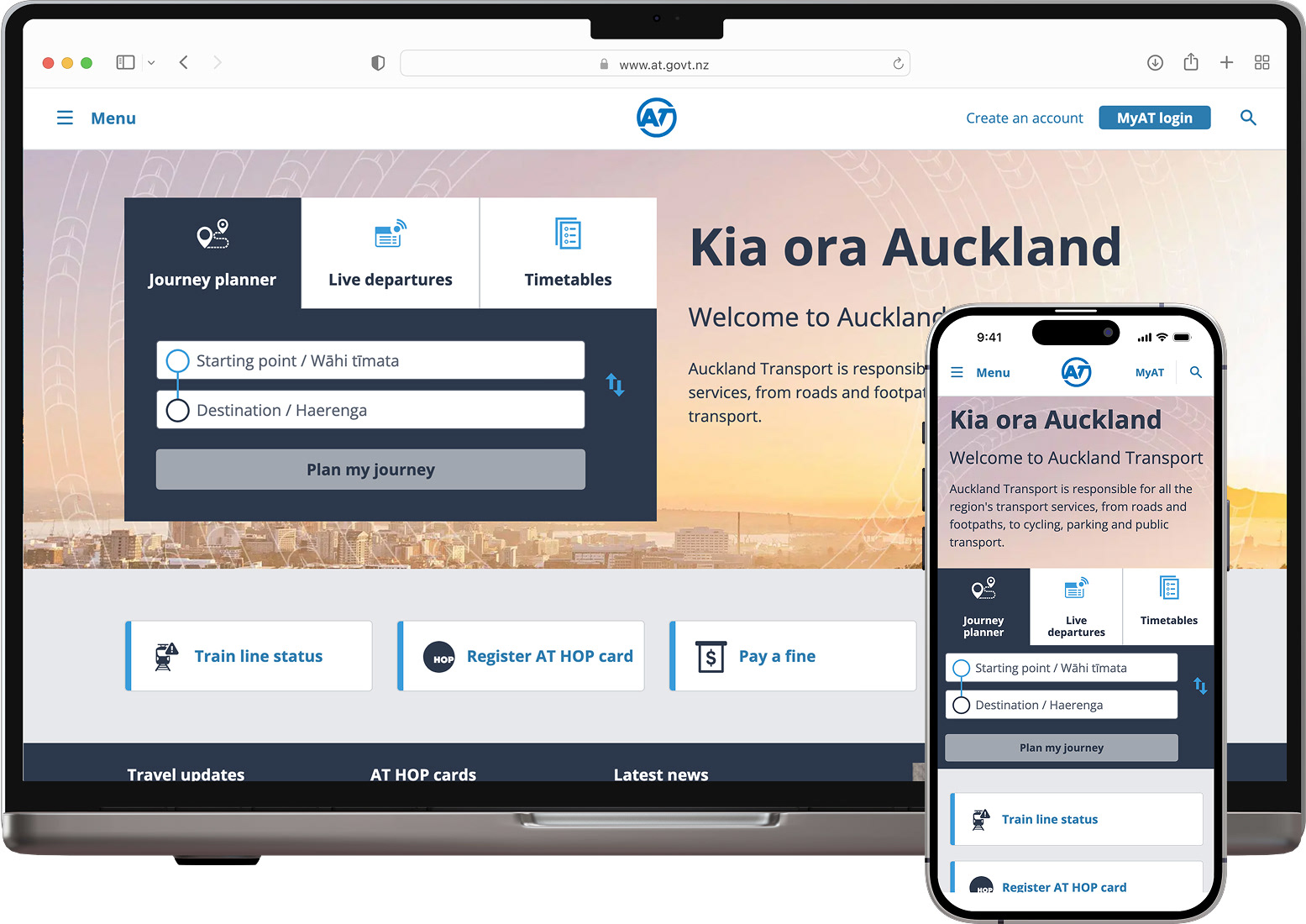
Hero Section
Before (UX designer's work)
After (my UI design work)
Changes I made
Improved the contrast of the Journey Planner region; sized and cropped the hero image to be more appealing; made the intro text easier to read as putting text on an image is difficult to make accessible; removed the ‘disabled’ button state as this is bad for accessibility; removed the search icons as the 'plan journey' button performs the action of search; used the correct design system tabs, included Te Reo in the form labels, and made general spacing and alignment improvements to increase visual appeal.
Improved the contrast of the Journey Planner region; sized and cropped the hero image to be more appealing; made the intro text easier to read as putting text on an image is difficult to make accessible; removed the ‘disabled’ button state as this is bad for accessibility; removed the search icons as the 'plan journey' button performs the action of search; used the correct design system tabs, included Te Reo in the form labels, and made general spacing and alignment improvements to increase visual appeal.

MAIN CHANGES
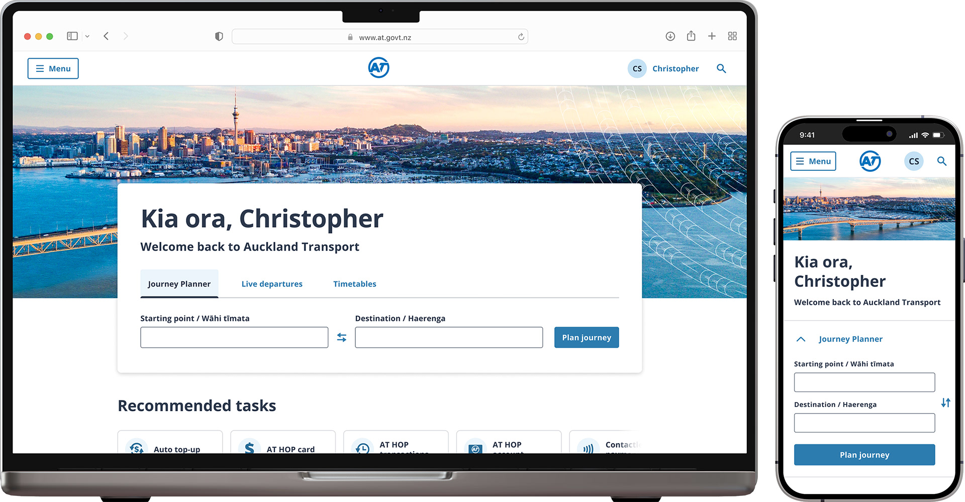
Hero Section —Personalisation
Before (UX designer's work)
After (my UI design work)
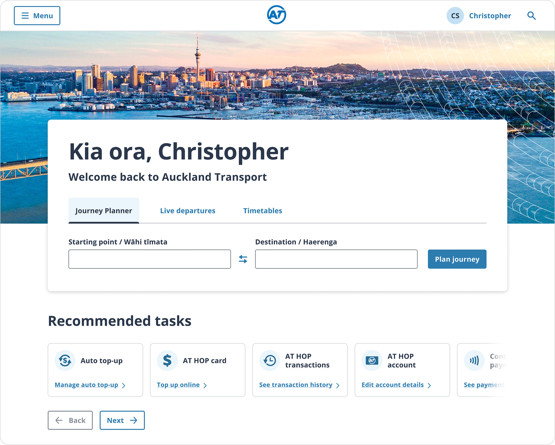
Changes I made
Kept the same hero section layout so it was clear that this was still the homepage, added personalisation within the Journey Planner widget, moved ‘recommended tasks’ beneath the hero section, adjusted the carousel design to show that there were more cards, designed additional icons for the new cards where these icons didn't exist in the design system.
Kept the same hero section layout so it was clear that this was still the homepage, added personalisation within the Journey Planner widget, moved ‘recommended tasks’ beneath the hero section, adjusted the carousel design to show that there were more cards, designed additional icons for the new cards where these icons didn't exist in the design system.

MAIN CHANGES
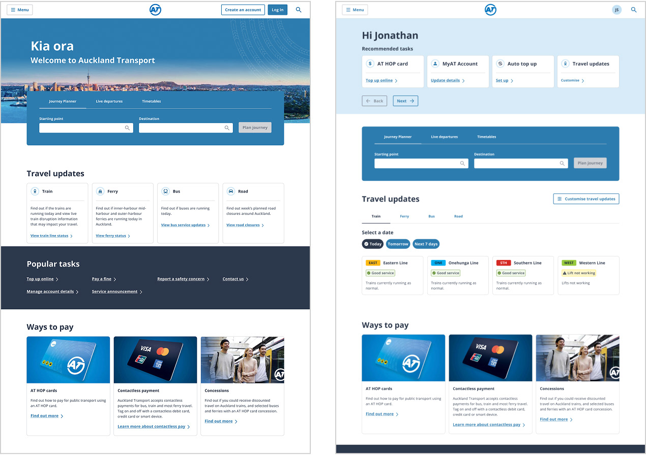
Popular tasks
Before (UX designer's work)

After (my UI design)
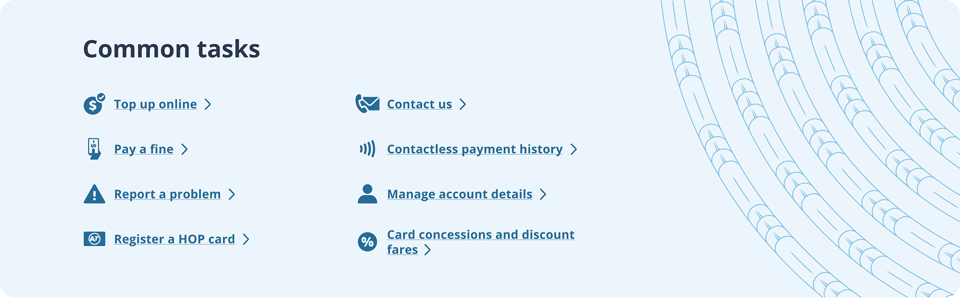
Changes I made
Aligned with brand, reduce to two columns to make easier to scan, added icons to make each link more visually distinct, included unaunahi pattern.
Aligned with brand, reduce to two columns to make easier to scan, added icons to make each link more visually distinct, included unaunahi pattern.

Final design

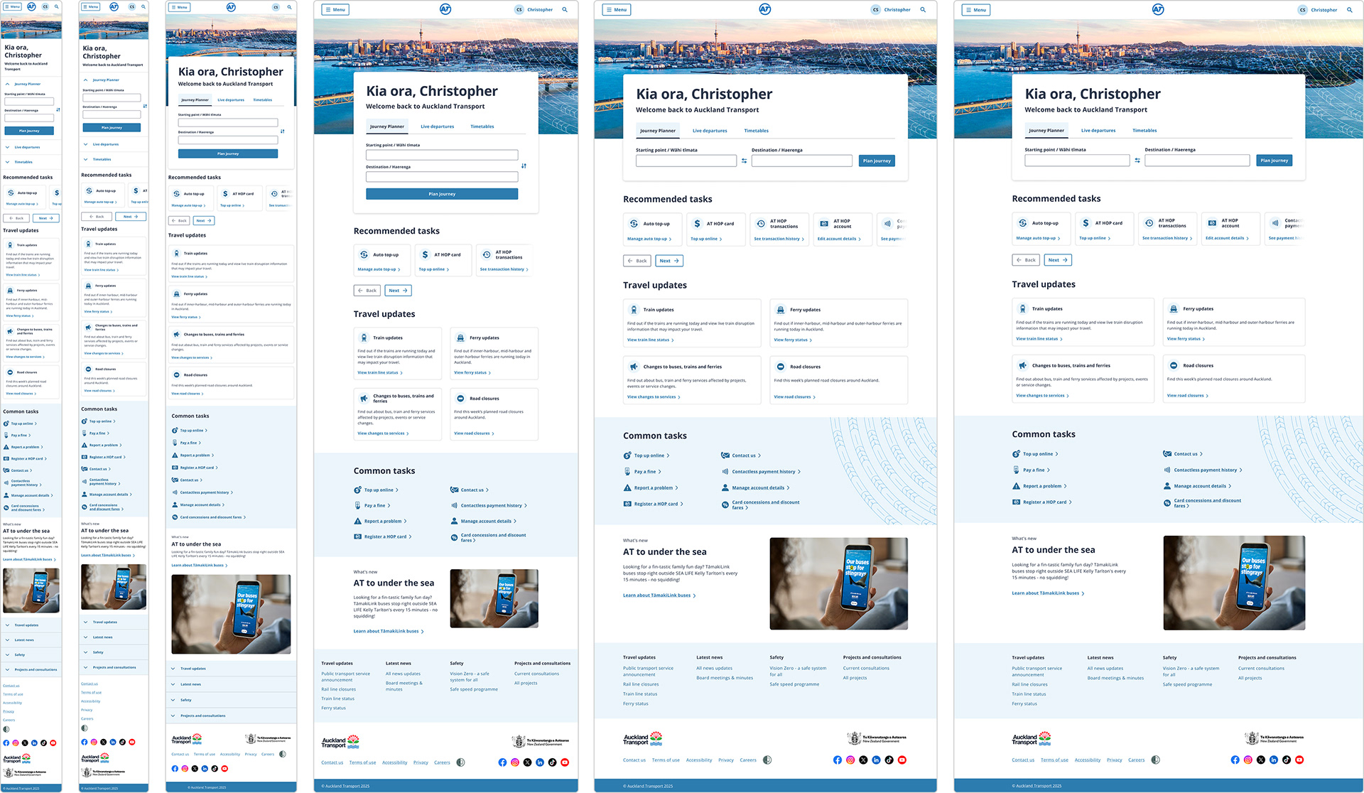
Breakpoints & handover
The handover included designs for all required screen sizes, aligned to the appropriate grids, so developers had everything needed to implement the page accurately across breakpoints.

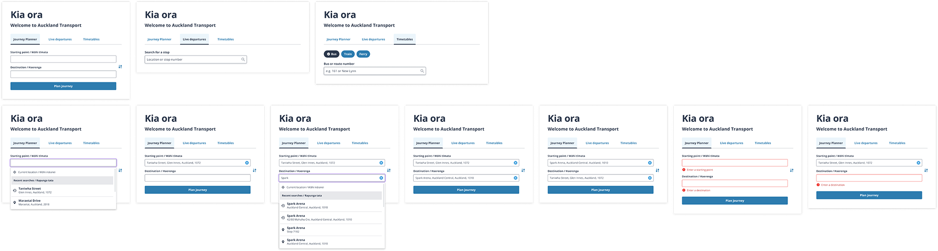
Example component states
Each new component needed to be defined and entered into the design system. This is a fraction of the component that was designed, as all breakpoints and state changes were designed and included in the design system.
Each new component needed to be defined and entered into the design system. This is a fraction of the component that was designed, as all breakpoints and state changes were designed and included in the design system.

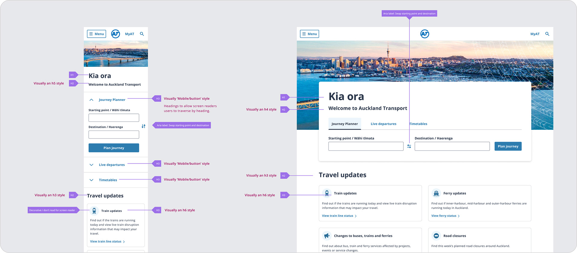
Accessibility
Annotation was included as part of the handover phase, which included heading hierarchy, screen reader specific copy and tab order.


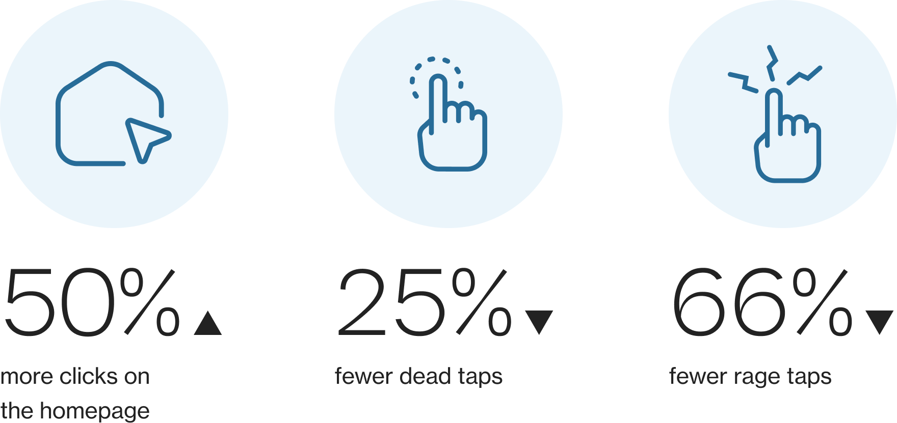
Results

Live version