
Roles
UI Design
UI Design

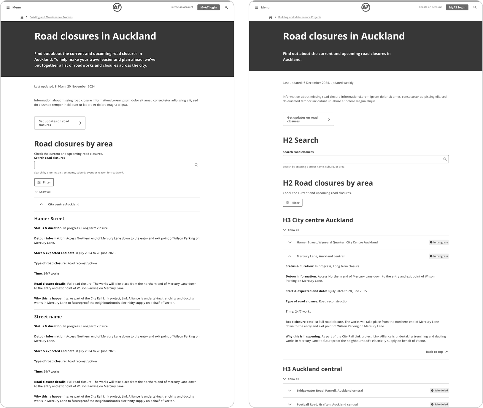
The old design
The previous version listed all closures in one giant table, which most users found extremely hard to navigate and find the information they needed.

OPTION A & OPTION B
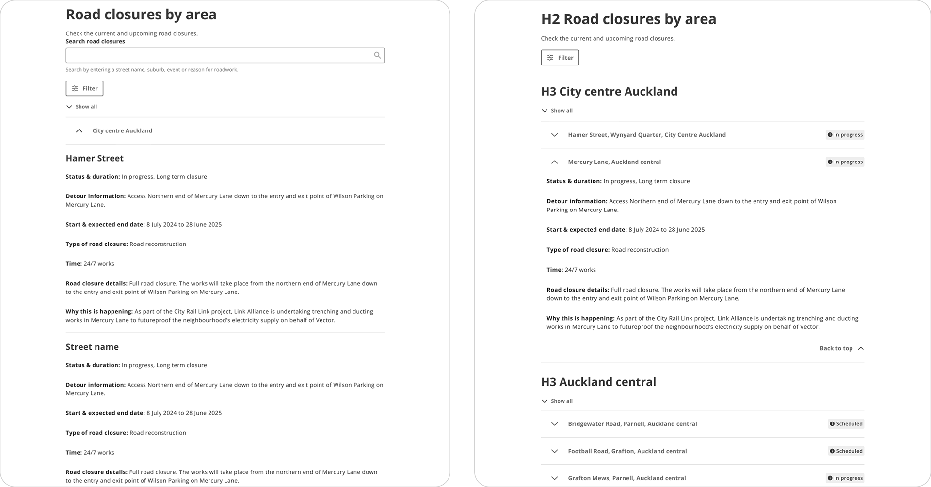
UX Design
The UX designer mocked up wireframes for the new page design. Each version used accordions to condense content down into more digestible regions, and also included an in-page search to act as a filter.
There was a separate filter in the design but in user testing people ignored this. The in-page search functions as a filter by design anyway.

My role as UI designer
After the UX designer completed their process, my role as the UI designer was to incorporate user feedback they acquired and ensure the design system was applied correctly, WCAG guidelines were met, and the design was in alignment with brand standards.
See how I elevated the UX designs and usability below

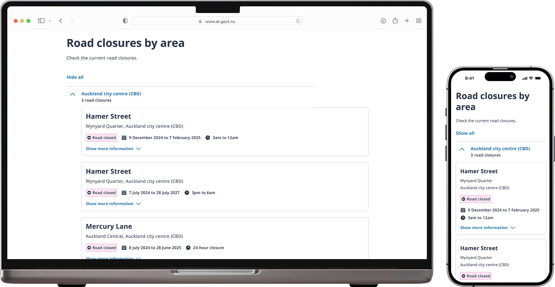
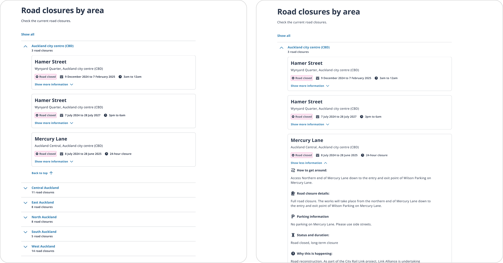
New card layout
I felt that the design that had all closed streets expanded by default was not an option on mobile as this would be too much information and scrolling. I decided to design a new layout for testing that used cards and included more high-level context such as number of closures per region, to help users make the decision to open an accordion item or not.

MAIN CHANGES
Road closures
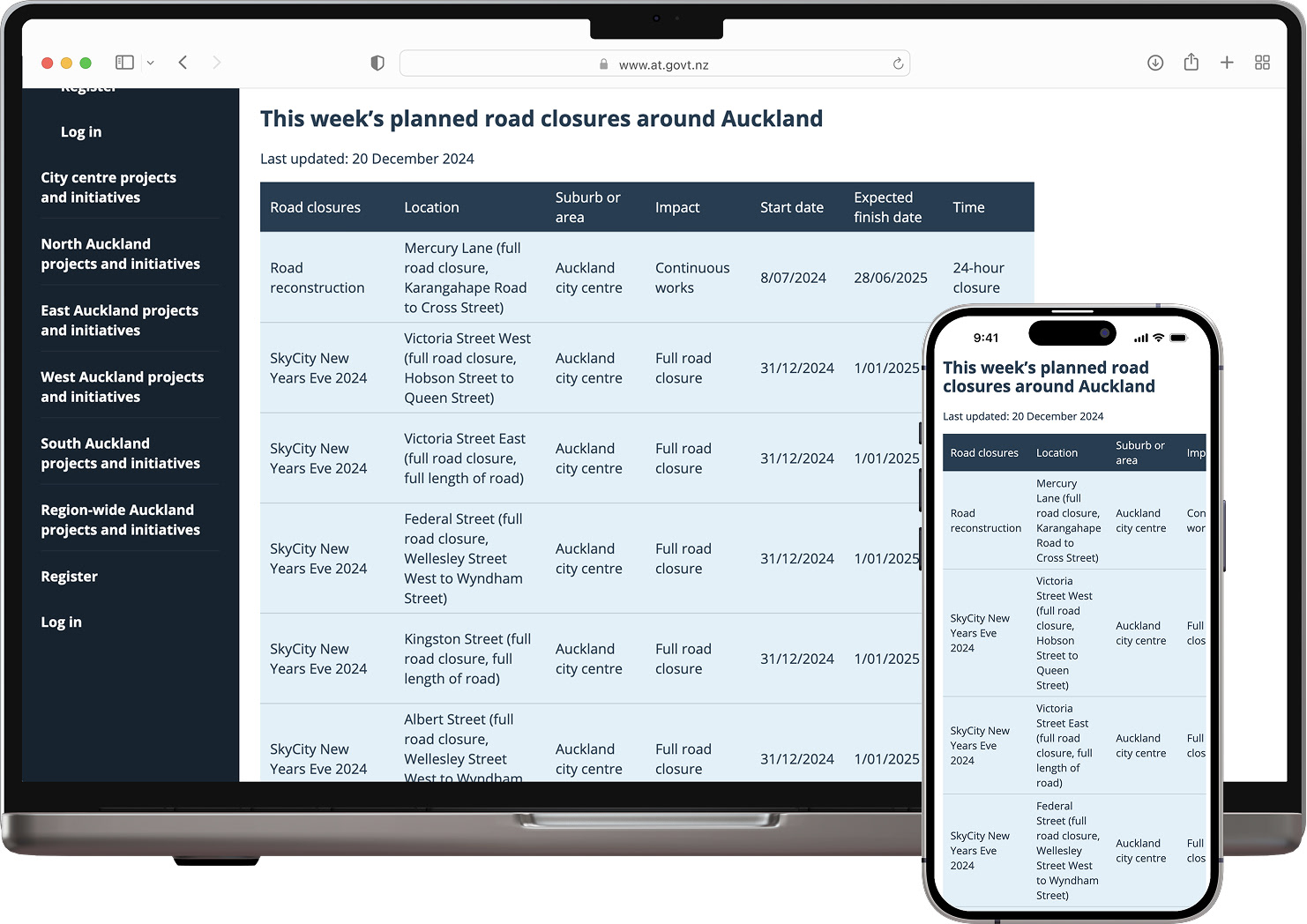
Before (UX designer's work)
After (my new layout option)
Changes I made
Improved the hierarchy of the street/region, added ‘x road closures’ to each area, included the most important high-level information for each of the impacted roads in an expandable card so the user has more up-front information, added icons to the details so content is easier to scan, left aligned ‘back to top’ for better accessibility.
Improved the hierarchy of the street/region, added ‘x road closures’ to each area, included the most important high-level information for each of the impacted roads in an expandable card so the user has more up-front information, added icons to the details so content is easier to scan, left aligned ‘back to top’ for better accessibility.

User preference
All users preferred the card layout for its clear overview and simple navigation. They found the other option too lengthy and unclear.
Note: all user testing was conducted by the UX designer, not myself.

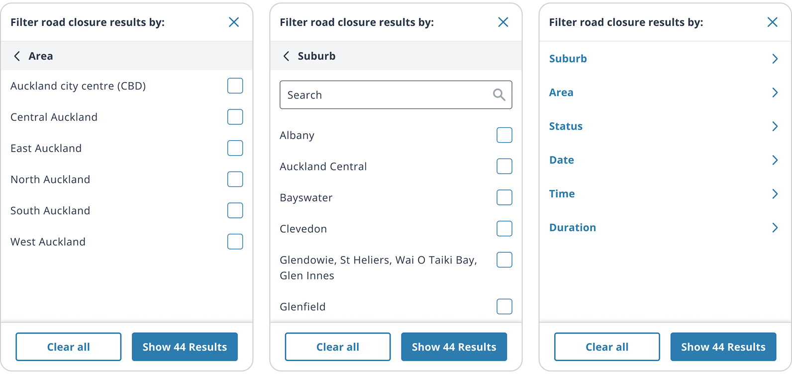
Proposed filter
I included a filter design for the user testing sessions. While users were able to use the filter without issue, they didn’t see it as necessary as they would primarily use the in-page search function.

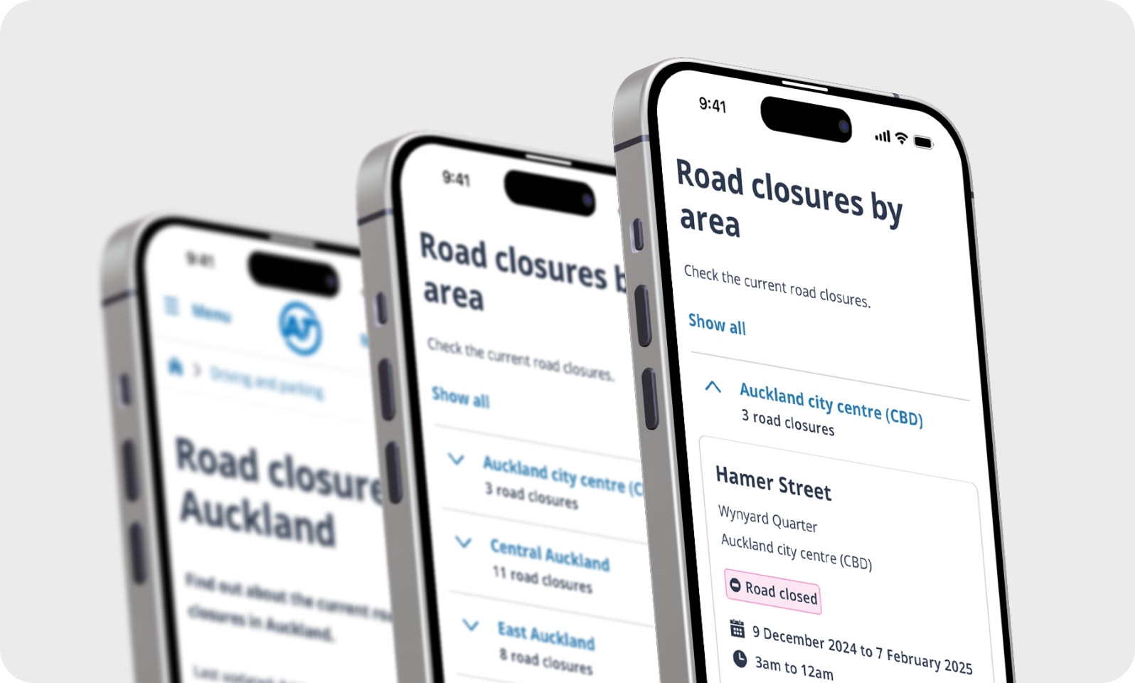
Final
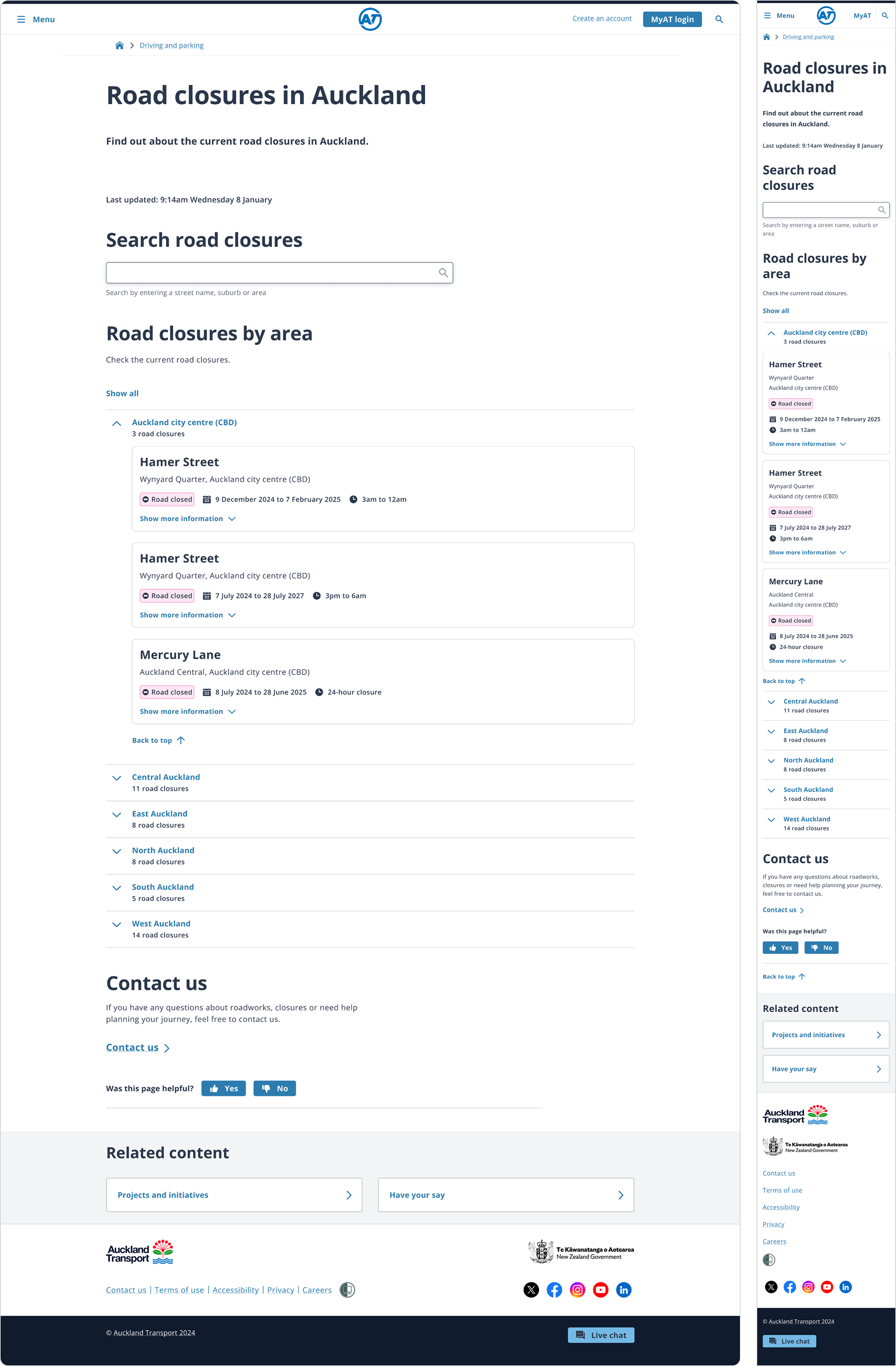

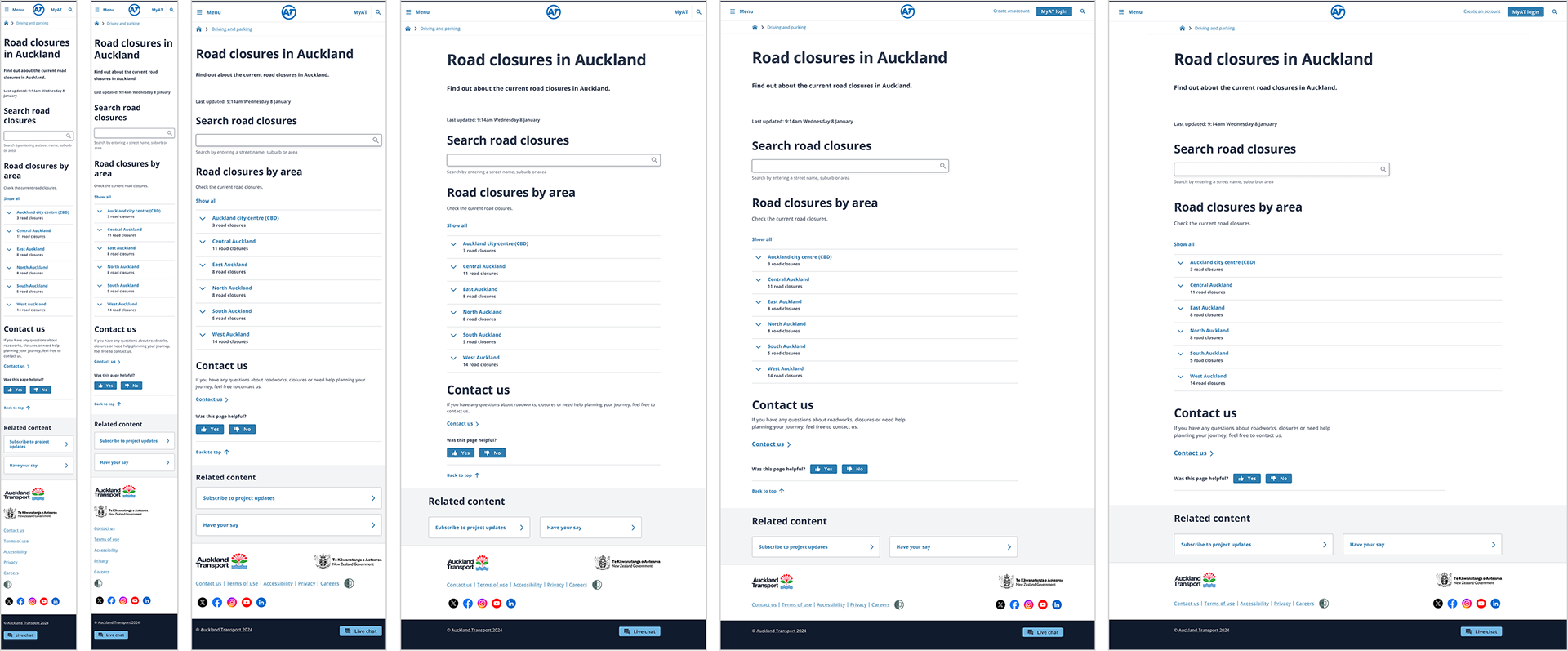
Breakpoints & handover
The handover included designs for all required screen sizes, aligned to the appropriate grids, so developers had everything needed to implement the page accurately across breakpoints.


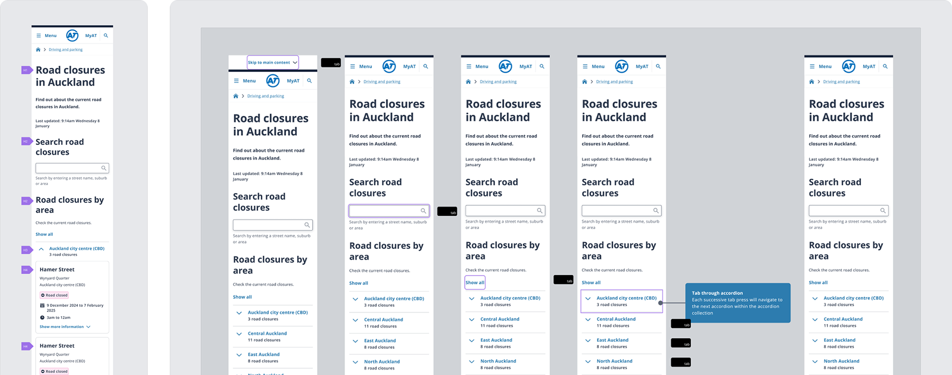
Accessibility
Annotation was included as part of the handover phase, which including heading hierarchy, screen reader specific copy and tab order.


Scope
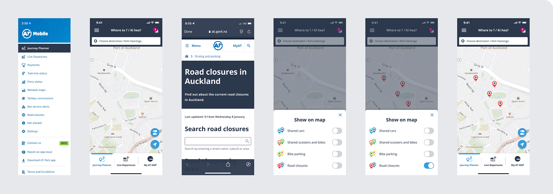
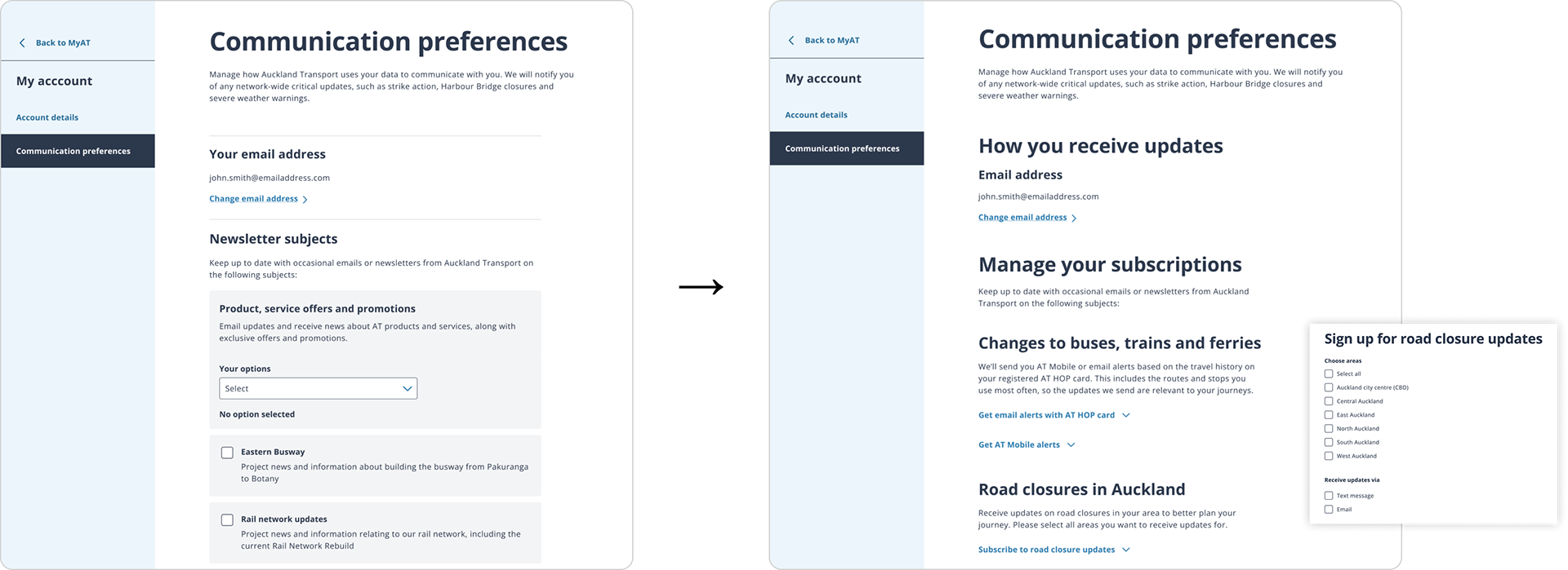
With any project there are scope limitations. For example, we knew maps were desirable but the ability to implement them was not available within the time frame. A number of other avenues were explored but ultimately not included.


Live version