Roles
UX design
UI design
UX design
UI design

The goal of this project was to make the bus transfer experience from within the AT mobile app easier to use.
I worked on this project with the UX designer. My role in this project was UX and UI design of the interfaces, with rapid ideation and iteration. My contract ended before this project ended, so the designs displayed here aren't final and weren't yet tested.

The current experience
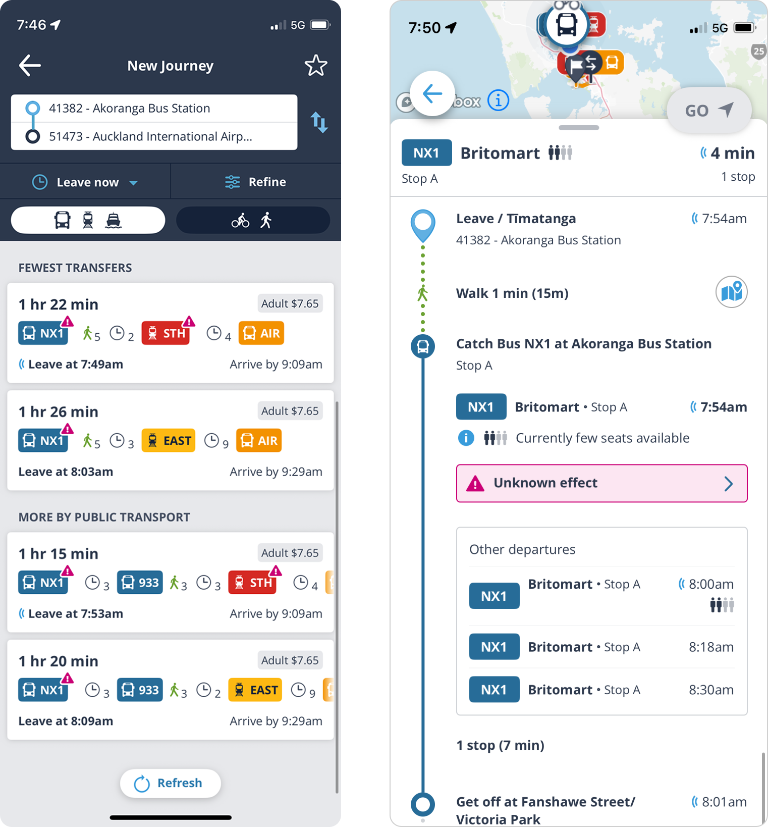
When the user has to take more than one service, the experience is not ideal, especially when it is over 2 services.
There are issues such as cards requiring horizontal scrolling when there are more than 3 services; it is unclear that cards represent a single route that includes multiple departure times.
An itinerary with multiple legs in the journey is also very long, with minimal chunking and grouping of content, and a lot of unnecessary content exposed by default.
There are issues such as cards requiring horizontal scrolling when there are more than 3 services; it is unclear that cards represent a single route that includes multiple departure times.
An itinerary with multiple legs in the journey is also very long, with minimal chunking and grouping of content, and a lot of unnecessary content exposed by default.

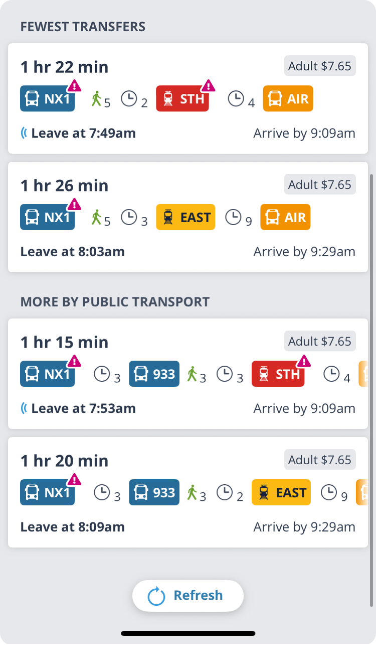
CURRENT STATE — JOURNEY CARD
Journey card
This card is difficult to scan as each there are 5 pieces of information arranged in a left, right, left, right rhythm which causes the eye to jump around.
Content here could be chunked together into related groups to make easier to scan.
Content here could be chunked together into related groups to make easier to scan.
Testing as part of another project revealed that most users don't know they can scroll horizontally within the cards to reveal all services.

FUTURE STATE — JOURNEY CARDS
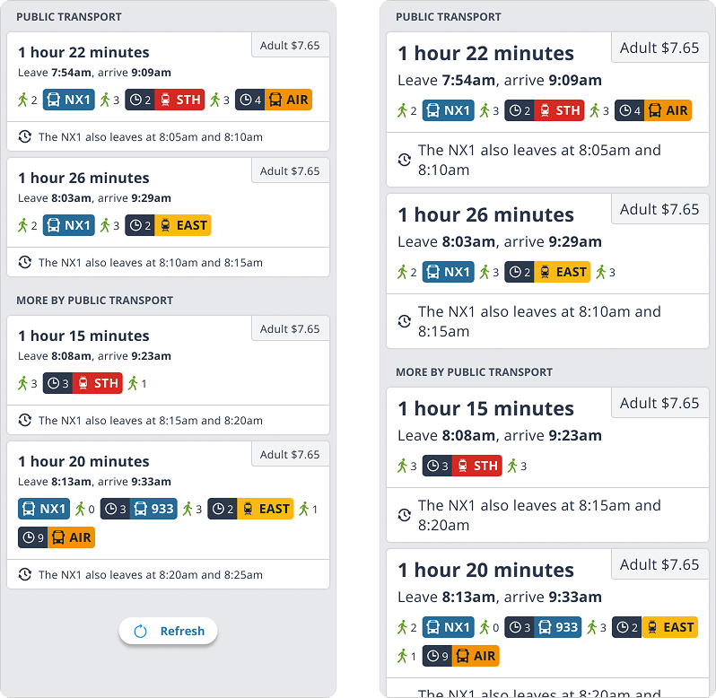
Proposed version
The time details were grouped into a single block, with ‘leave’ and ‘arrive’ put closer together as they're related.
Fare was de-emphasised so that the rest of the card is easier to scan.
Grouped the wait time with the service to make the row easier to scan.
Included new microcopy that explains that this specific journey has additional leaving times.
Fare was de-emphasised so that the rest of the card is easier to scan.
Grouped the wait time with the service to make the row easier to scan.
Included new microcopy that explains that this specific journey has additional leaving times.
Showed how this layout scales nicely when users scale their text to 135%.

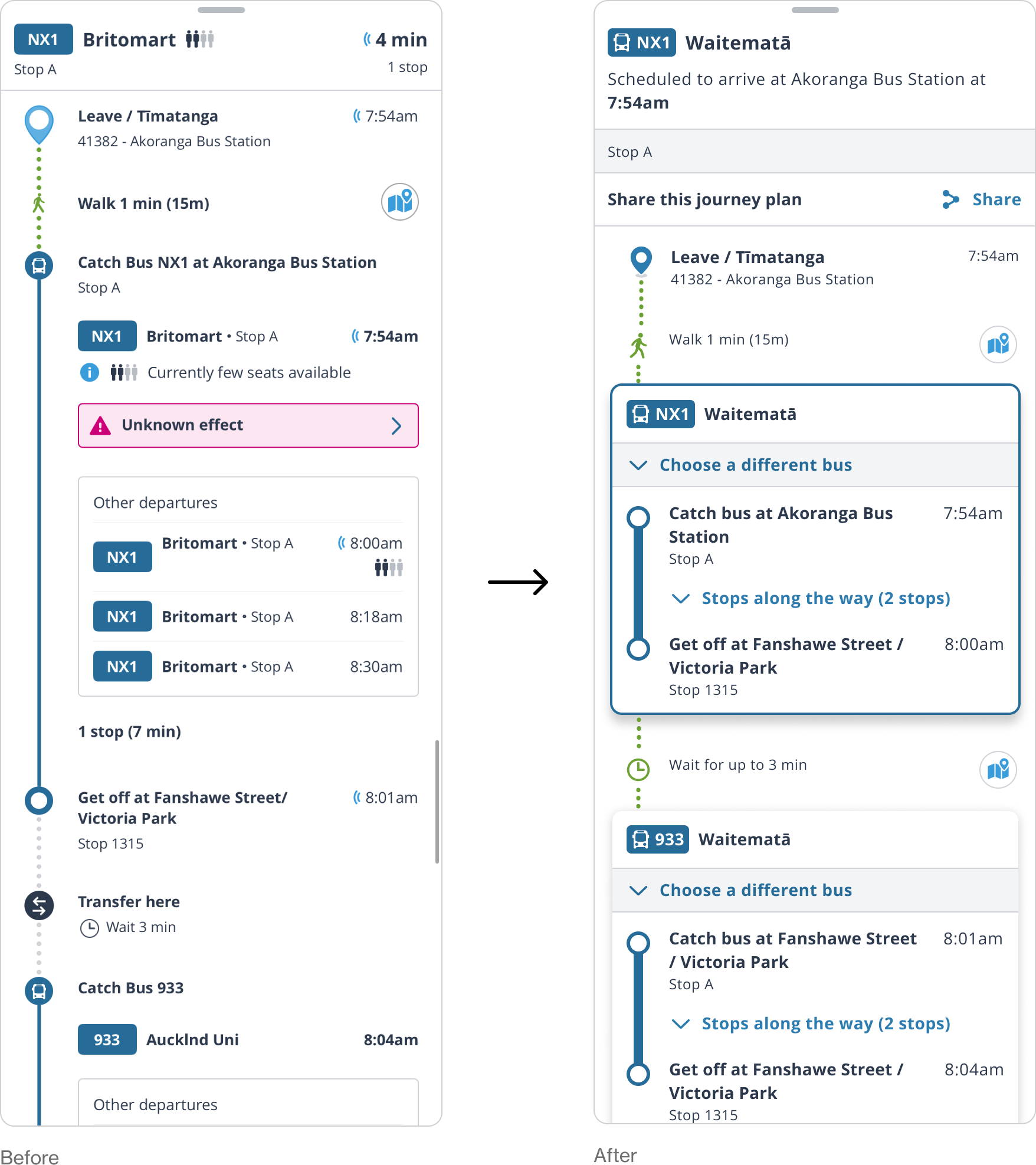
FUTURE STATE
Itinerary updates
The goal here was to make each leg of the journey much easier to see visually, as the previous version was quite busy, hard to scan, and comprehend.
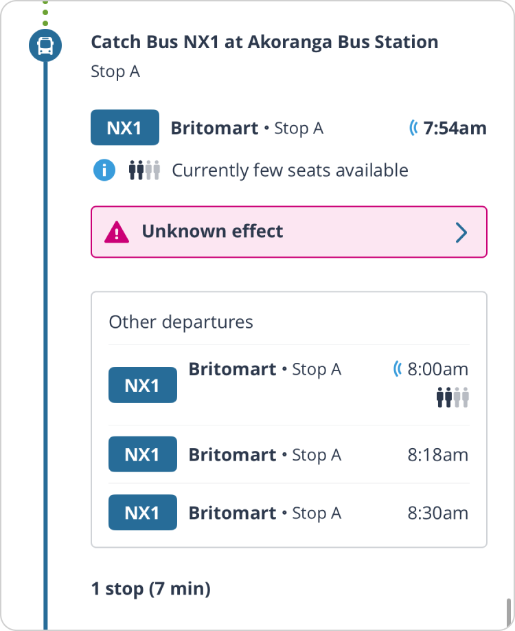
Sections in the old version such as ‘Other departures’ weren’t clear, and there was no way to update your journey to one of these 'other departures.'
In the new version my goal was to group all of the content much more clearly, making it easier to scan, and allow the user to make dynamic changes to their journey.
Sections in the old version such as ‘Other departures’ weren’t clear, and there was no way to update your journey to one of these 'other departures.'
In the new version my goal was to group all of the content much more clearly, making it easier to scan, and allow the user to make dynamic changes to their journey.

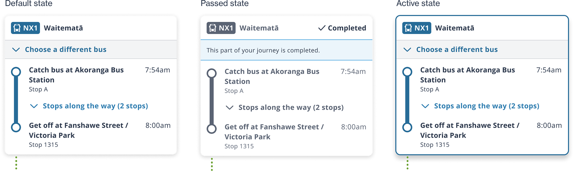
Leg states
Each leg in the new itinerary design also includes different states that update during the journey to more accurately show the user where they are in their journey.


Choosing a different bus, train or ferry
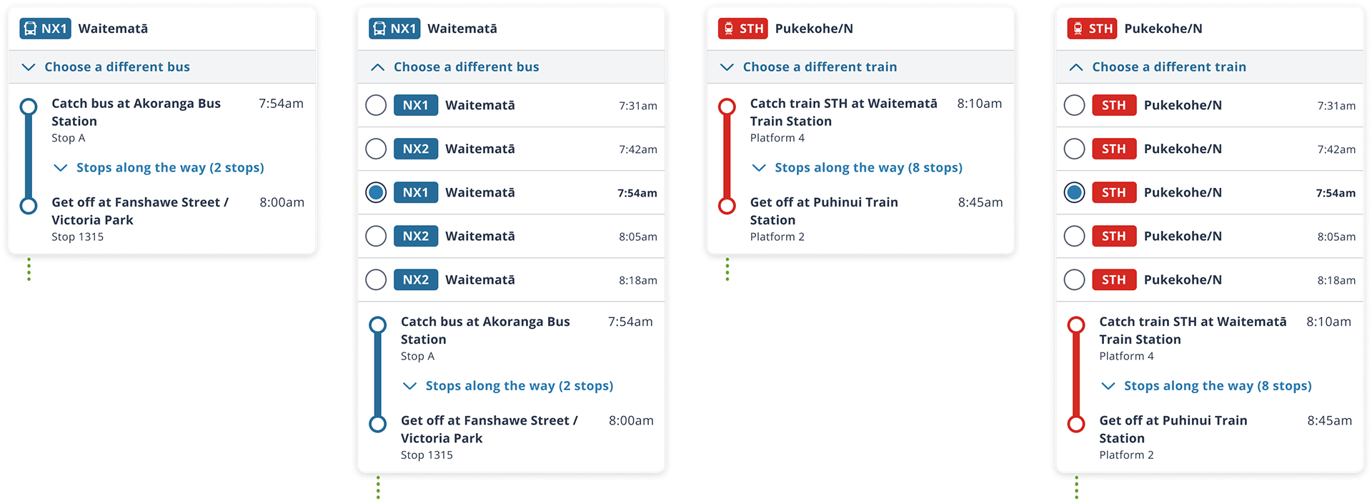
The current state of the app showed that there were other services as part of this journey that left at different times, but there was no way to change to these services from within the itinerary.
Choose a different service design
This design allows users to choose their service and update their journey in real time.

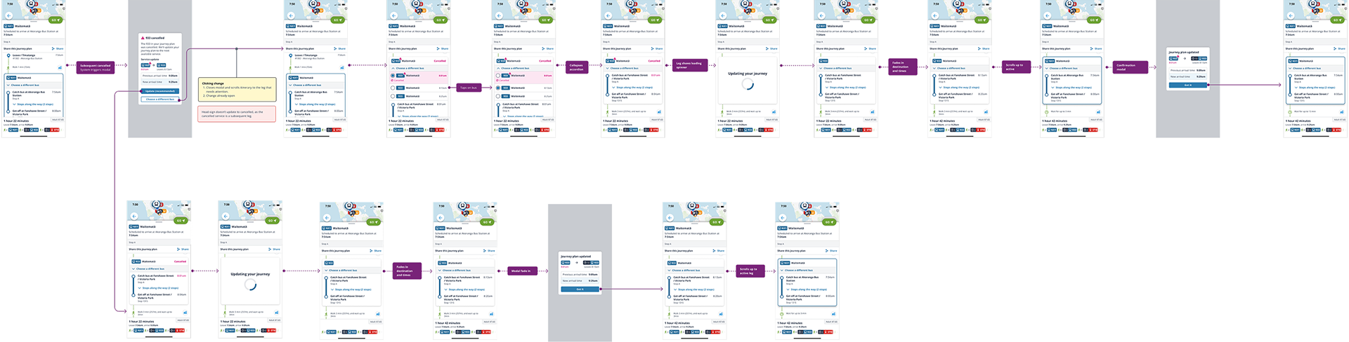
Cancelled Service
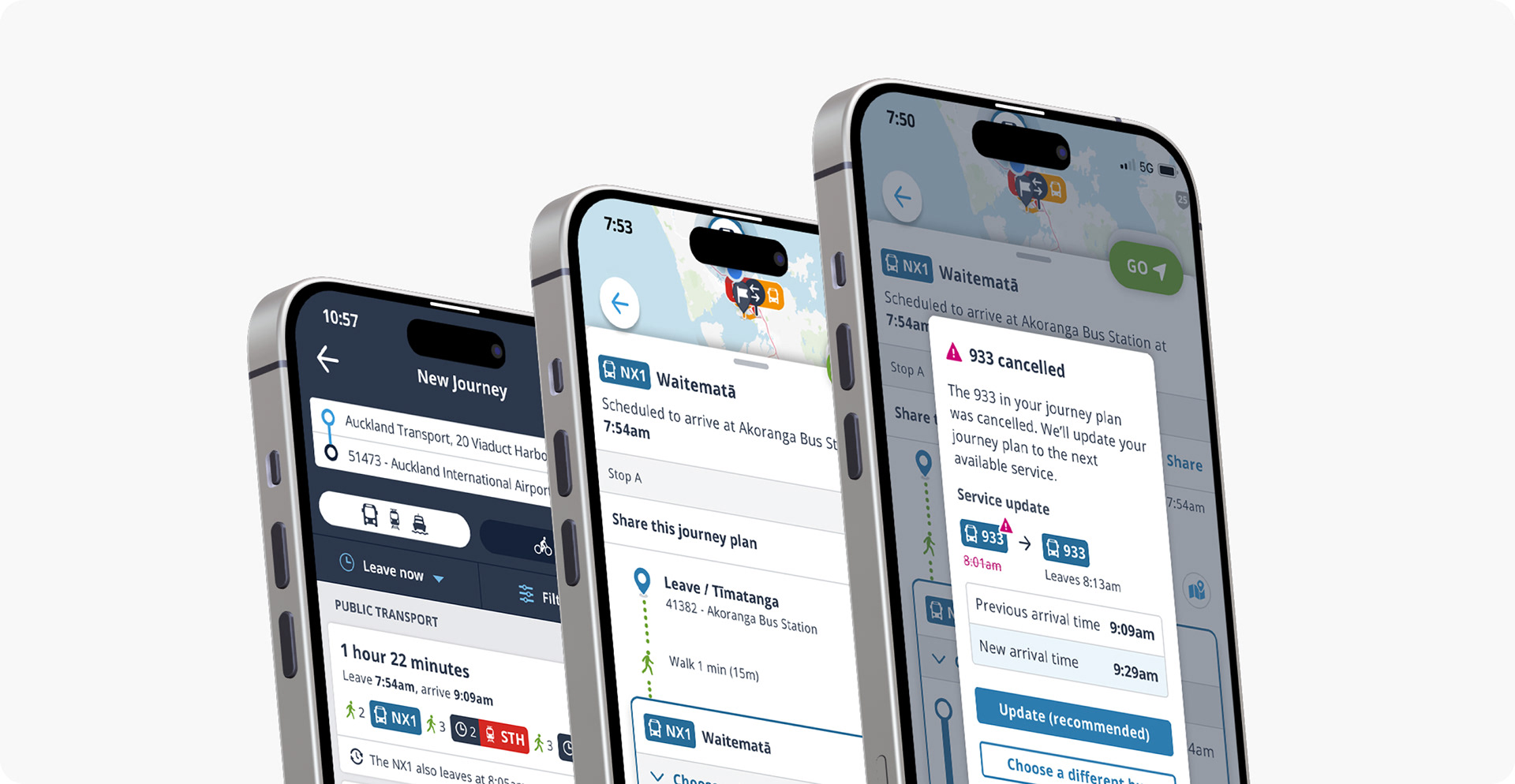
Sometimes a service is cancelled mid-journey. Using the 'choose a different' bus feature allowed me to design a flow in which a user is notified about the cancellation, and is then directed to choose a different service so that they can still complete their journey.
Video example:


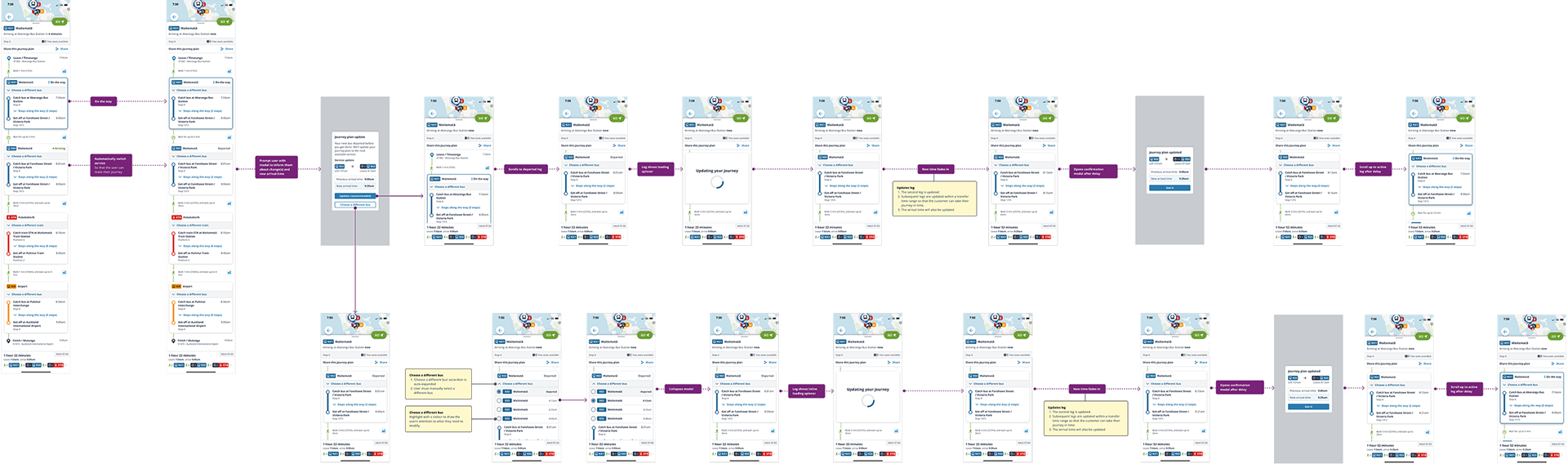
Bus is early flow
When a subsequent leg has a bus that is early, the user is given the option to auto update their journey, or choose a new service manually.
Video flow of auto-update:


Head-sign updates
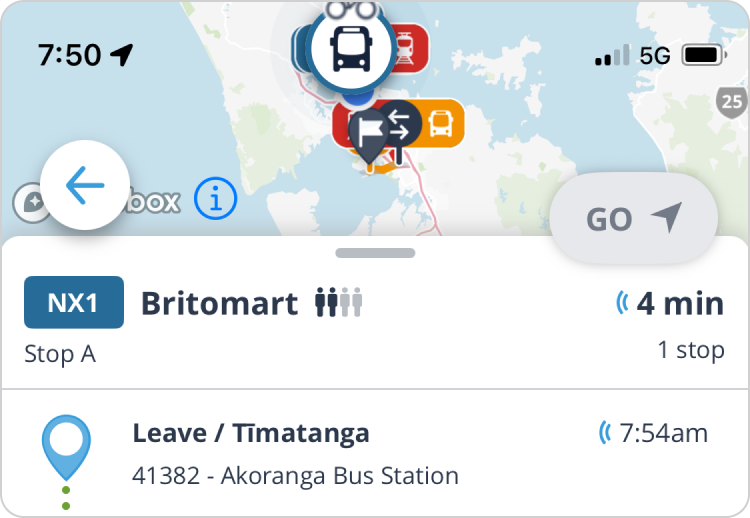
The current head-sign, while functional, had some issues. When testing was done by the UX designer, a lot of users were unsure about what the '4 min' icon meant, and whether '1 stop' meant '1 stop away' or not.
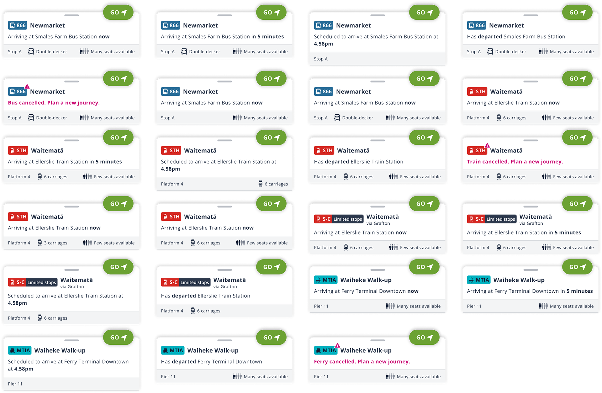
New head-sign designs
The UX designer and content writers came up with the variations in copy, e.g. 'Arriving at Smales Farm Bus Station now.' My role was to design the head-sign layouts. This is the final layout that we landed on.