
Roles
UI Design
UI Design

The goal of this project was to give AT mobile app users more visibility when a bus route has been diverted.
I collaborated with a UX designer who led the initial solution and user testing, I then used the resulting feedback to take the design through to final UI.

MVP VERSION
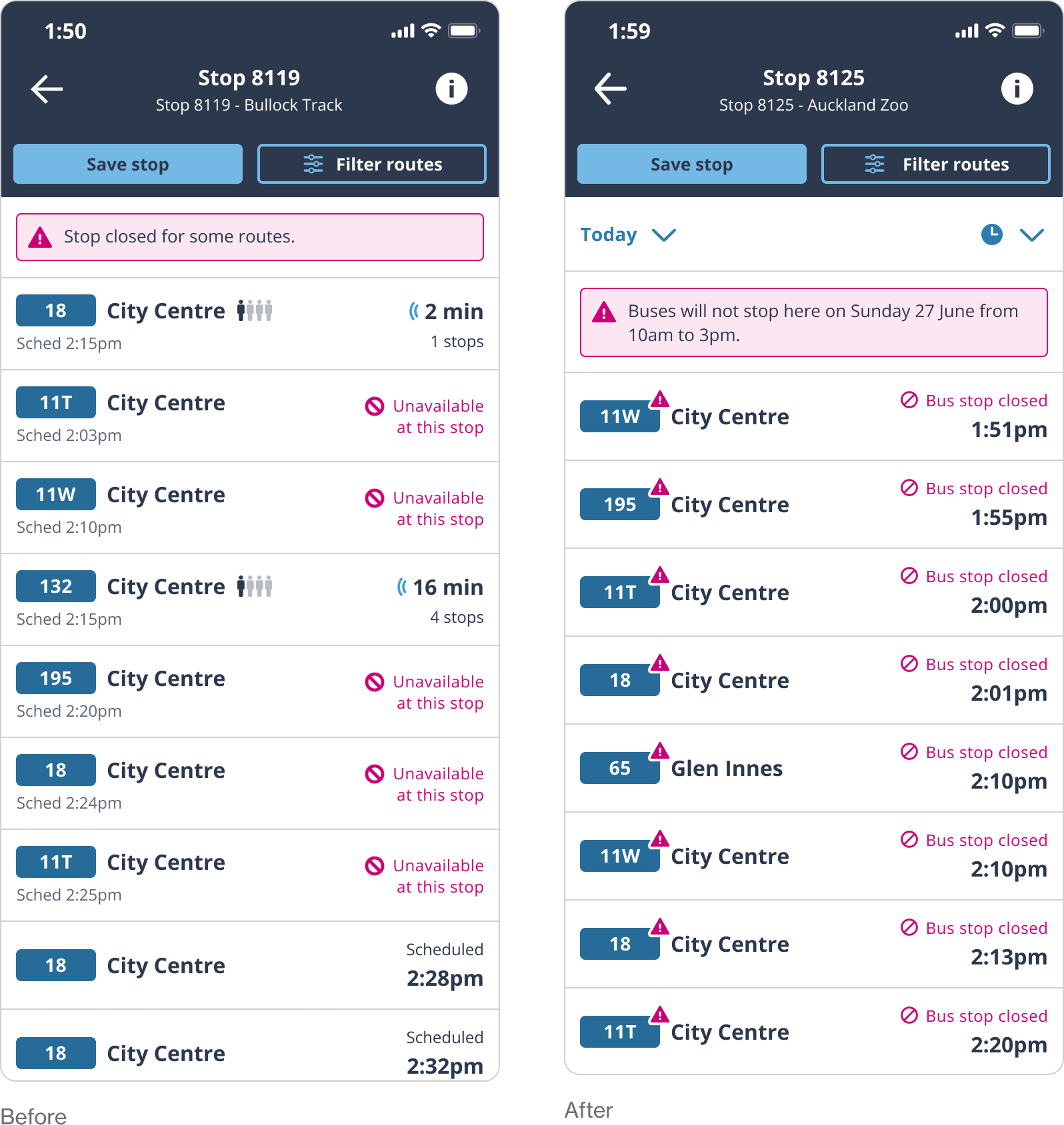
Departures list
The main changes from UX to UI were some changes to the copy to make it clearer, and to add the disruption triangle icon to the route pill.

MVP VERSION
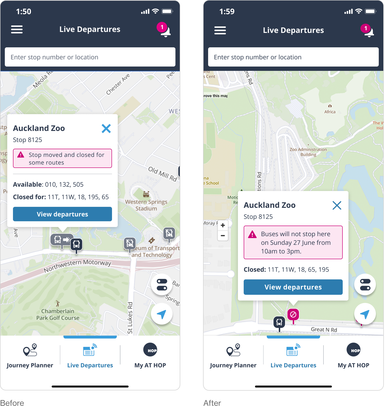
Live departures map
Users found the greyed out icons and design not clear enough, and preferred the straightforward strikethrough circle icon on magenta to signify a closed bus stop. Copy was updated to be more explicit.

MVP VERSION
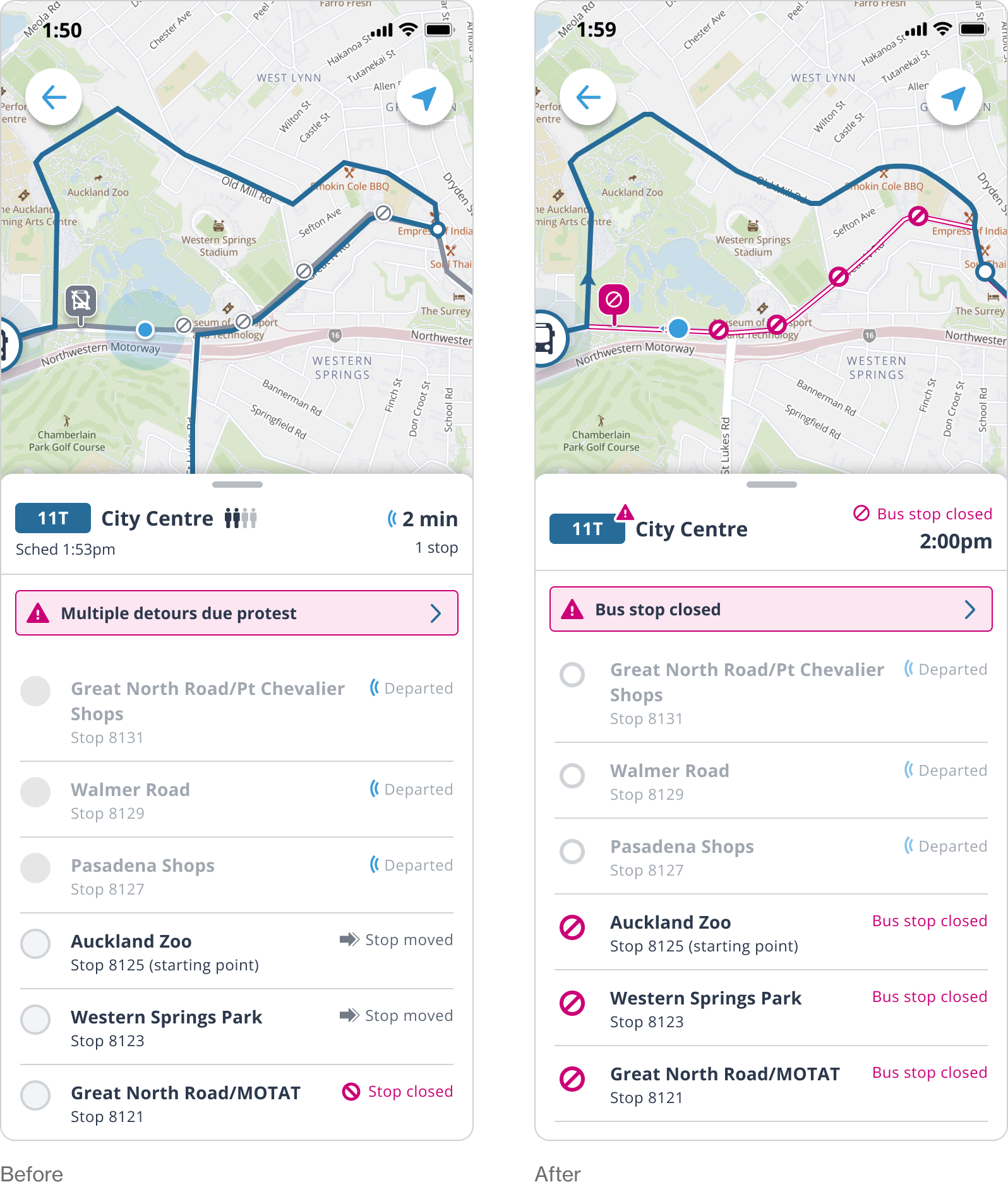
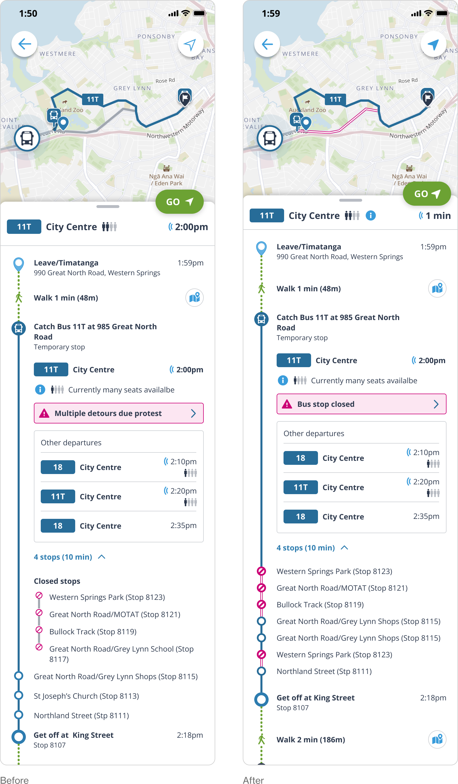
Route detail
In the AT mobile app, a solid magenta line is used to show a bus route that has replaced a train. I made the disrupted part of the route white with an outline, to differentiate it. The closed icon was updated to be easier to read at the smaller size.

MVP VERSION
Journey Planner
The main changes here were to incorporate the magenta line in the map, and to merge the closed stops in with the open stops. This design allows for multiple road diversions within one route and uses the clearer 'stop closed' icon.

MVP Handover
The final step of this stage of the project as the UI designer was the handover. In this step I provided all of the different annotated screens for the developers to work from.


Future state
The MVP version was limited in scope due to time and budget constraints. Most of the work for this project went into the future state, which is more feature rich.

FUTURE STATE
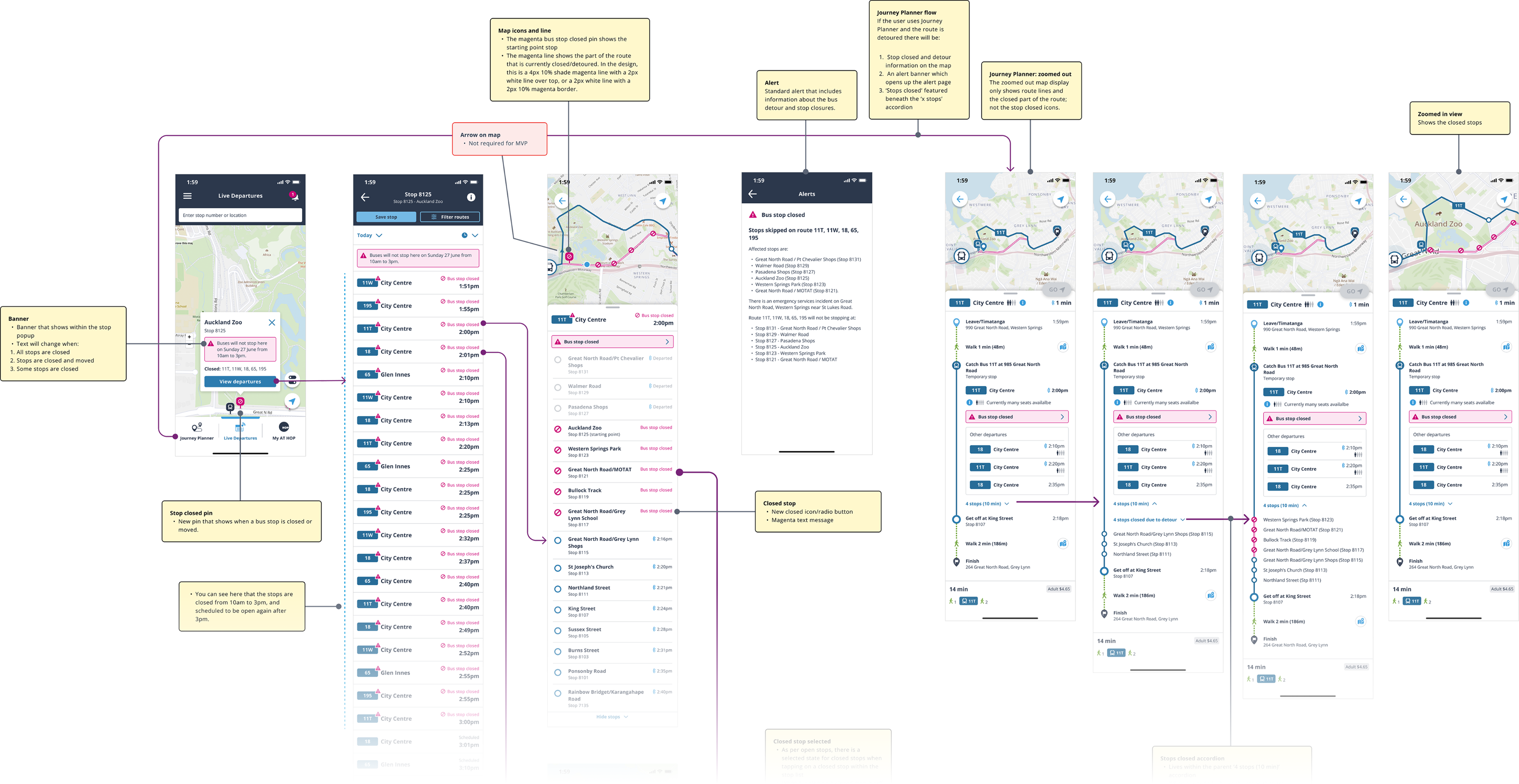
UX designs
The UX designer created two options for the future state version of the bus diversions feature. Option A was a split 50/50 view of map and route detail, Option B was a full screen view where you could switch between detail and map with the floating action button. 60% of users preferred option A so I took that option and developed it further.

Route filter - UX Design
In the UX design, all affected routes were shown at once. There was an option to filter these routes. When this was tested, users ignored the legend and the ‘filter route’ floating action buttons.

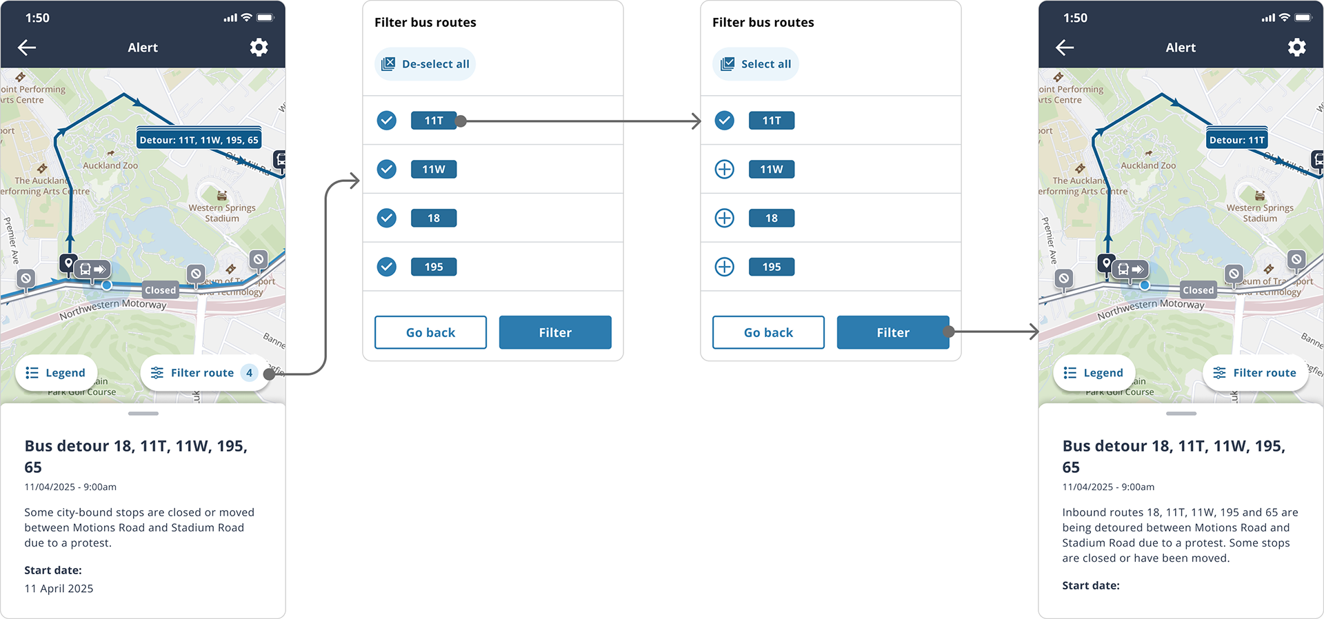

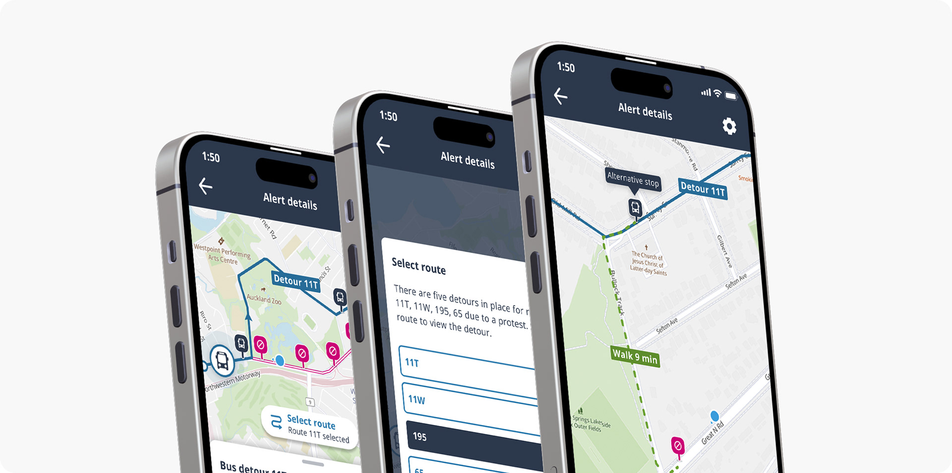
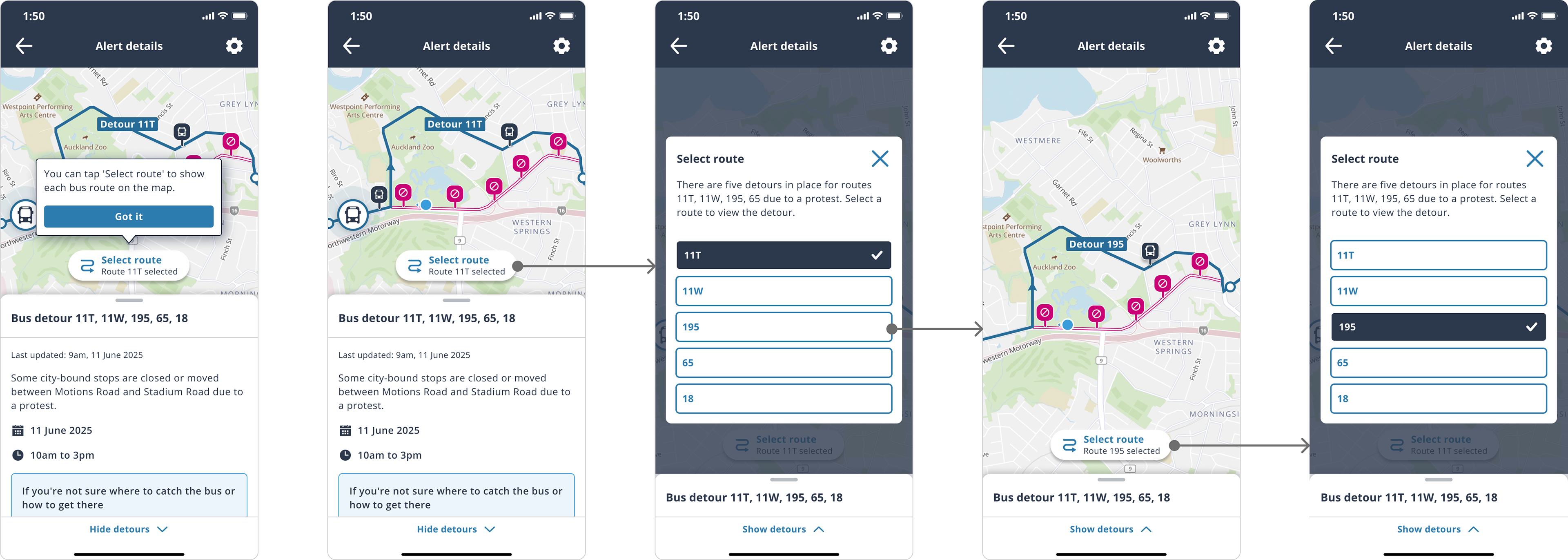
Route filter - UI Design
I found showing all routes on one map extremely hard to follow, so opted to show one route by default, and prompt the user with an onboarding screen that tells them about the new ‘select route’ floating action button. I changed the language from ‘filter route’ to ‘select route’ and also included a redesigned modal select window using clearer selection buttons.


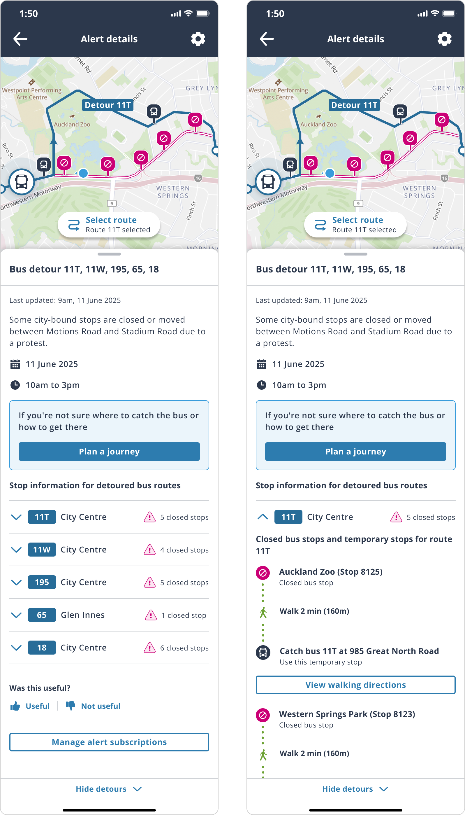
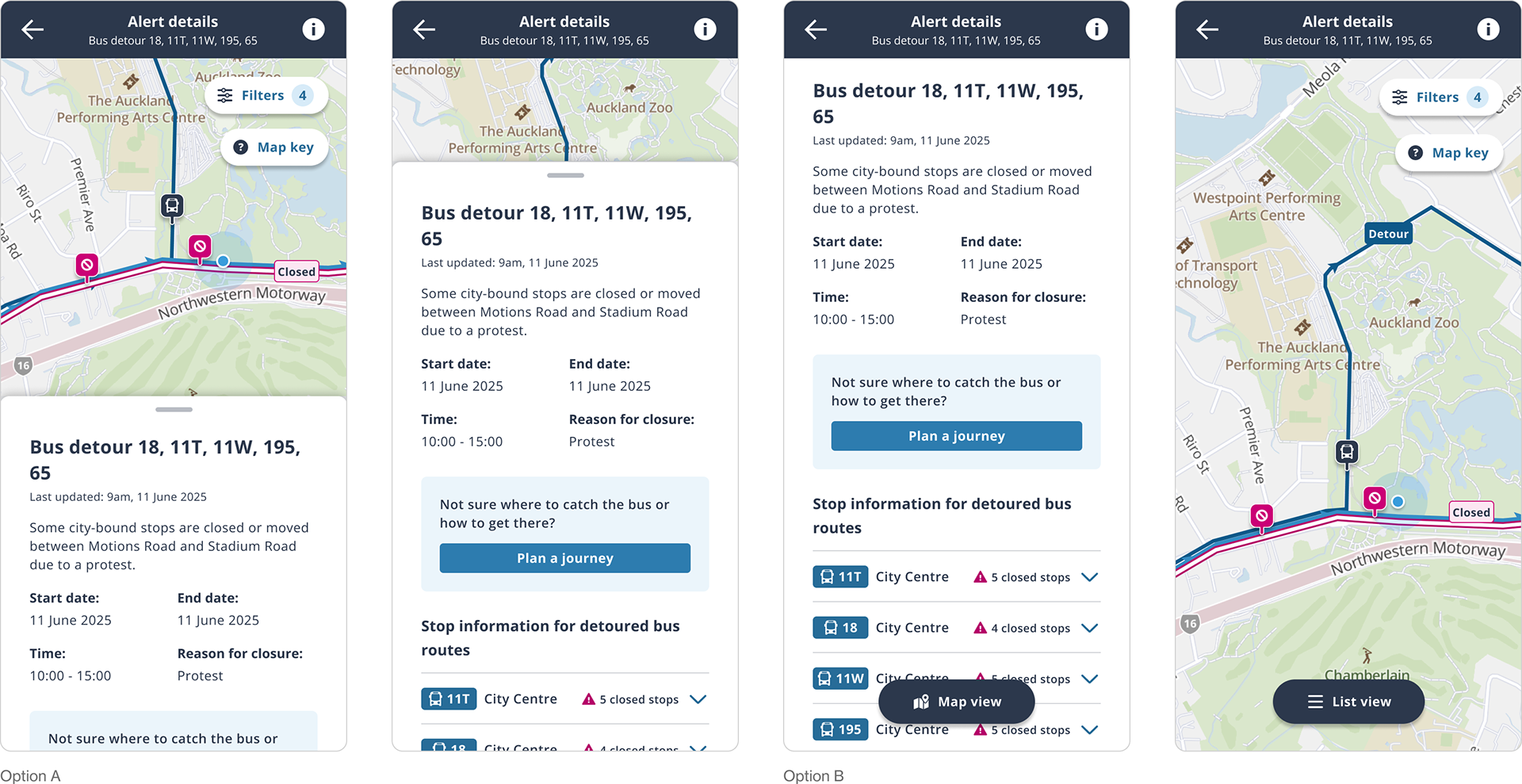
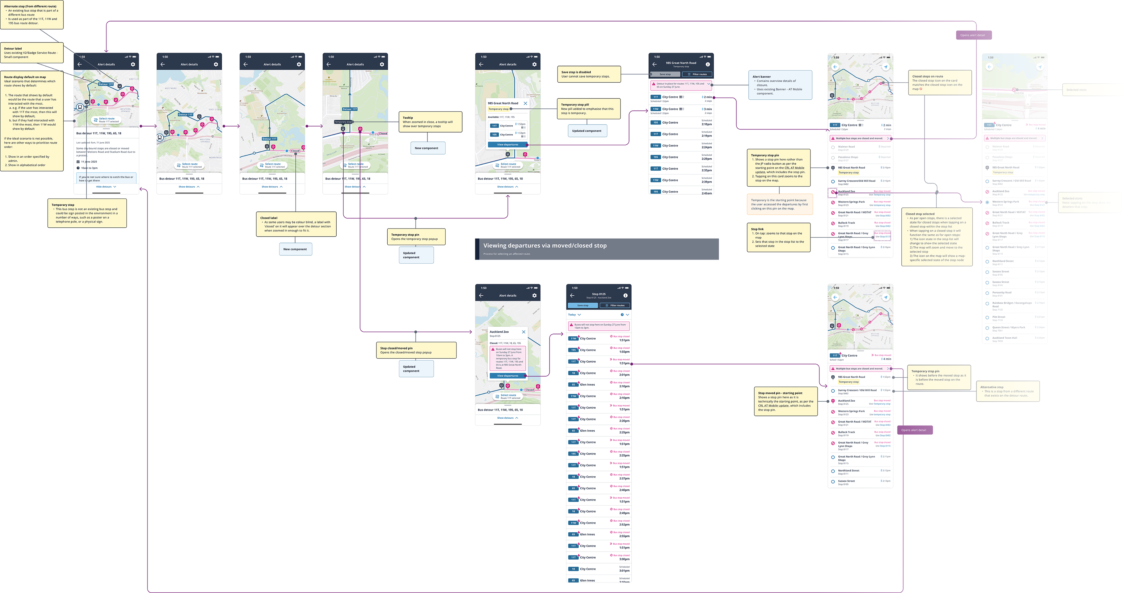
Alert details
The main changes I made here were the redesign of the route display and filter; broke up content with icons to make them easier to scan; moved the accordion arrow to the left as this had tested better in the past; used the design system version of the alert icon; made spacing and alignment adjustments in the accordion content.

Future state handover
As per the MVP handover, the final step of the future state stage of the project was providing all annotated page permutations for the developers to work from.

Bottom sheet tap behaviour

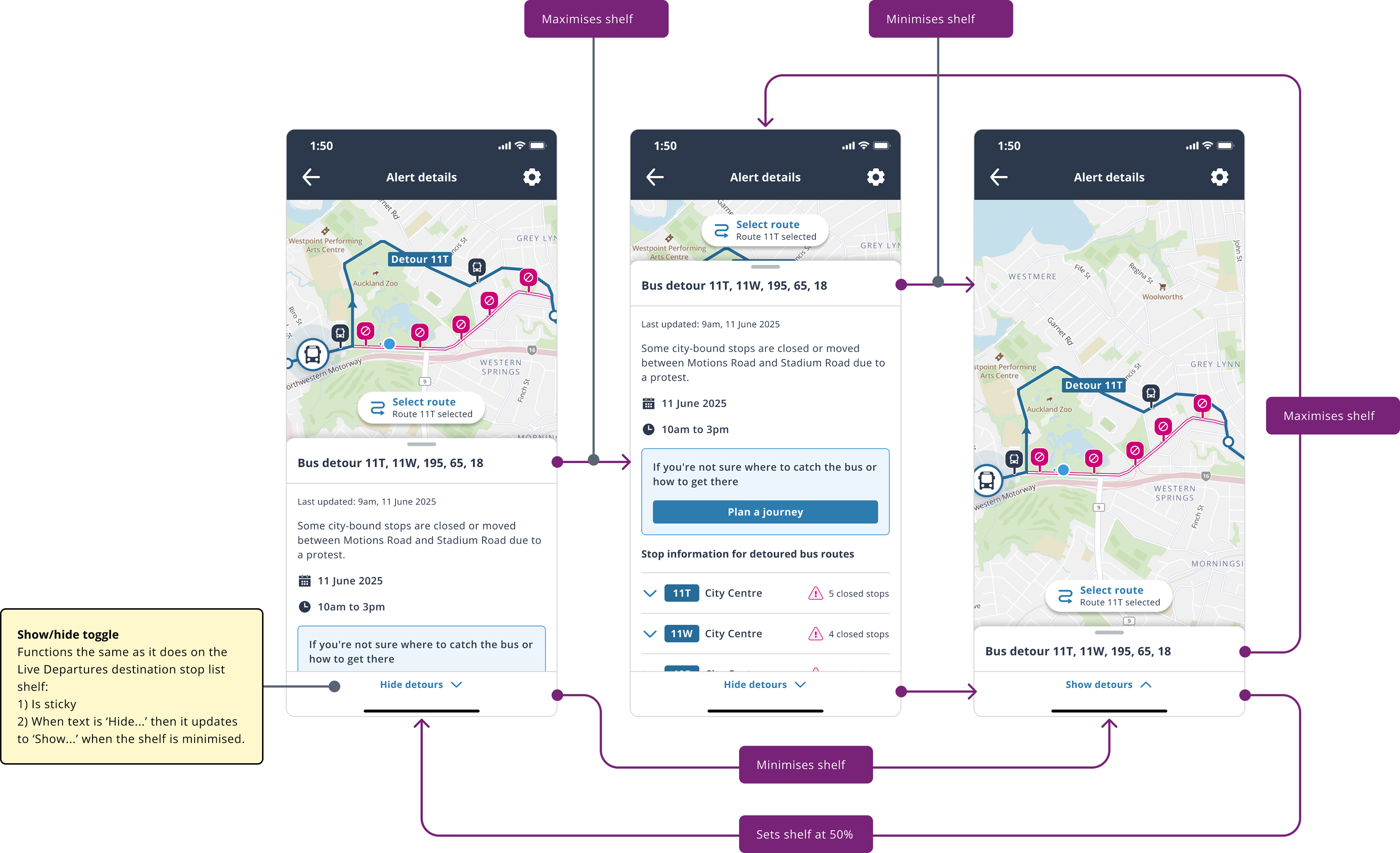

Shelf accordion behaviour
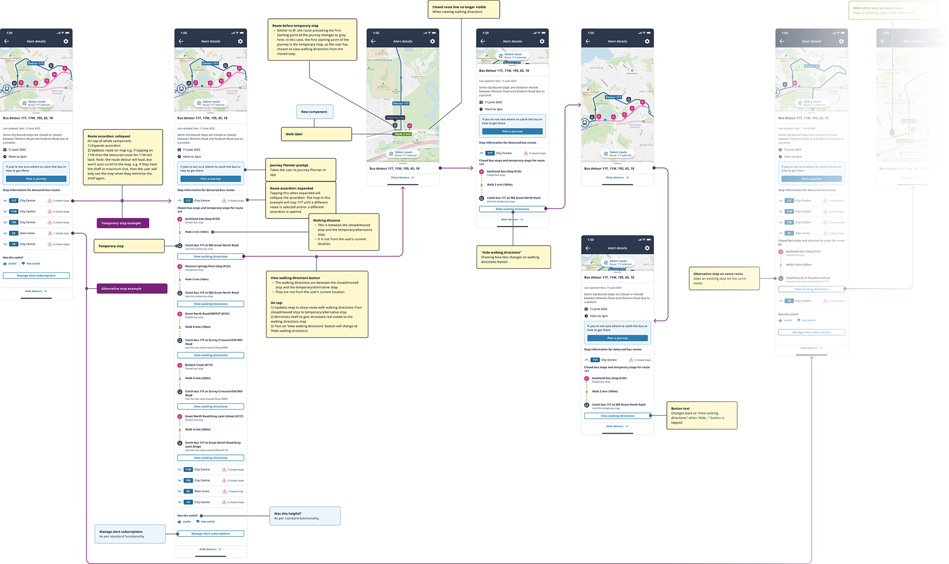
+ walking directions interactions
This flow shows all of the interactions a user can make with the route details shelf and its contents.

Route display
These flows show how the map and route display changes at different points of the journey.

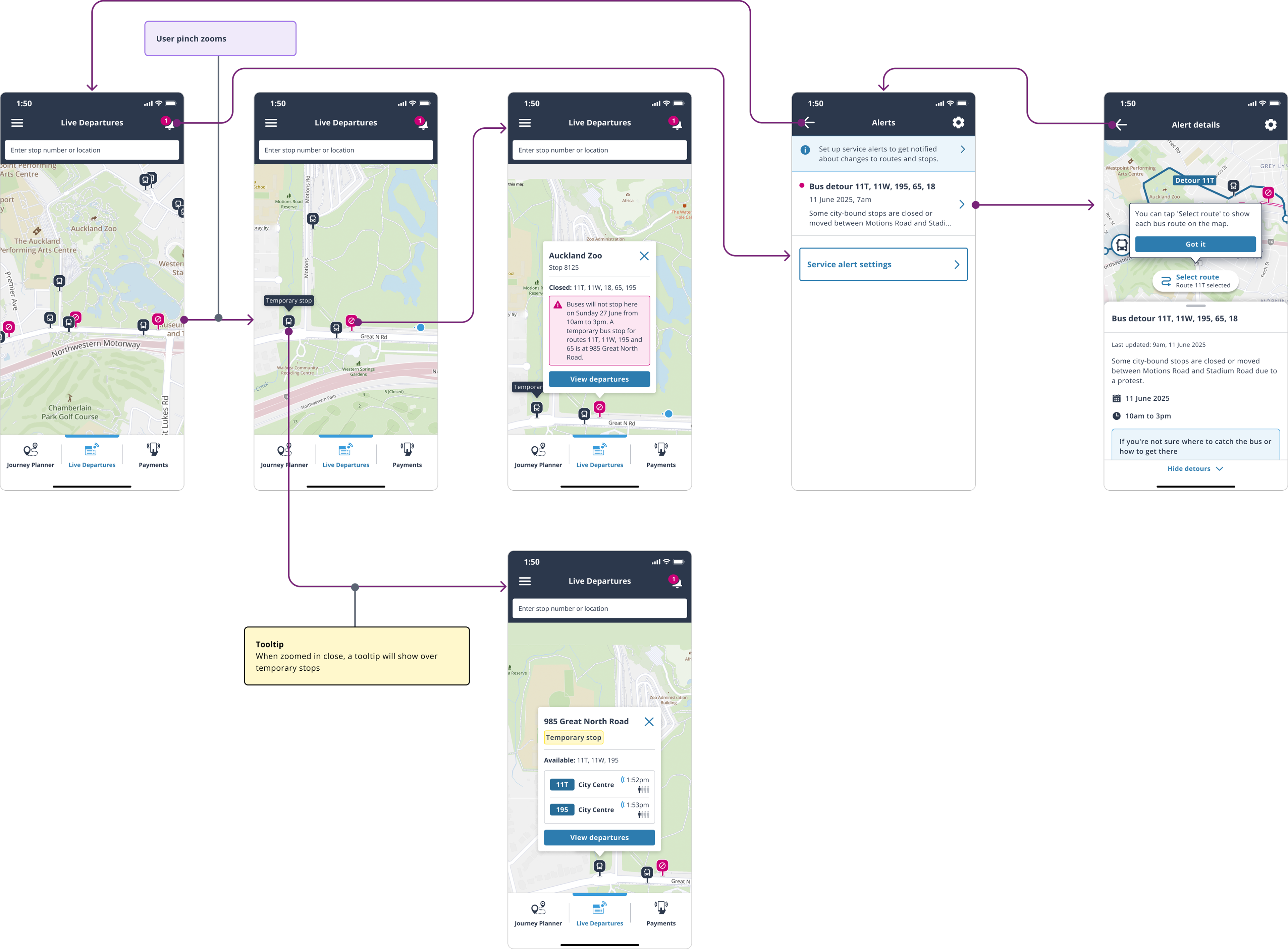
Live departures view
This flow shows how Live Departures will look with both closed and open stops on the map. It also shows how users can view the bus diversion alert

And more...
There were a number more flows created, such as "Alternative stop on the same route," "Alternative stop on a different route," and "No nearby stops."