I’ve created design systems from scratch and contributed to existing ones
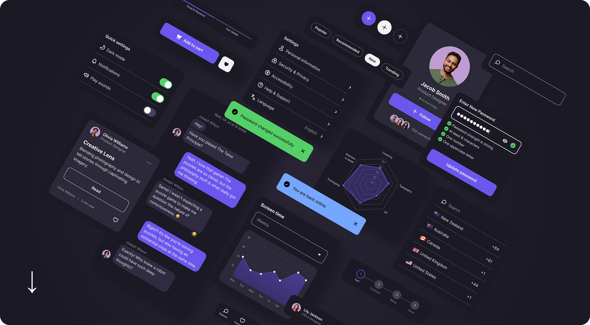
Below is an example of my own mobile app design system. It includes a light and dark mode, robust UI kit, and common user flow patterns.


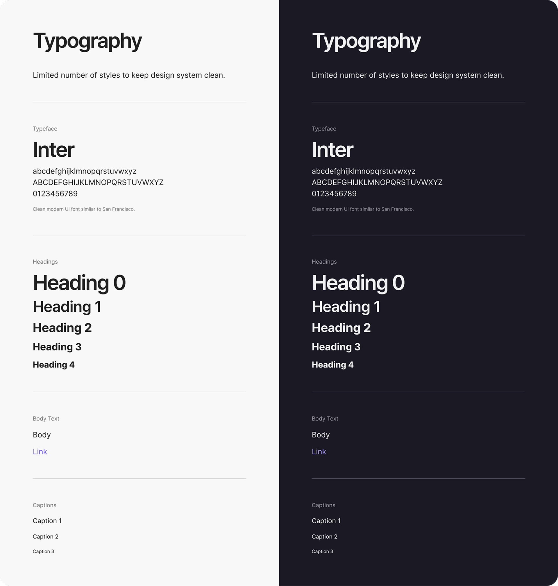
Typography
I like to keep typographic options limited so that it is much easier to control the design and keep elements visually consistent.

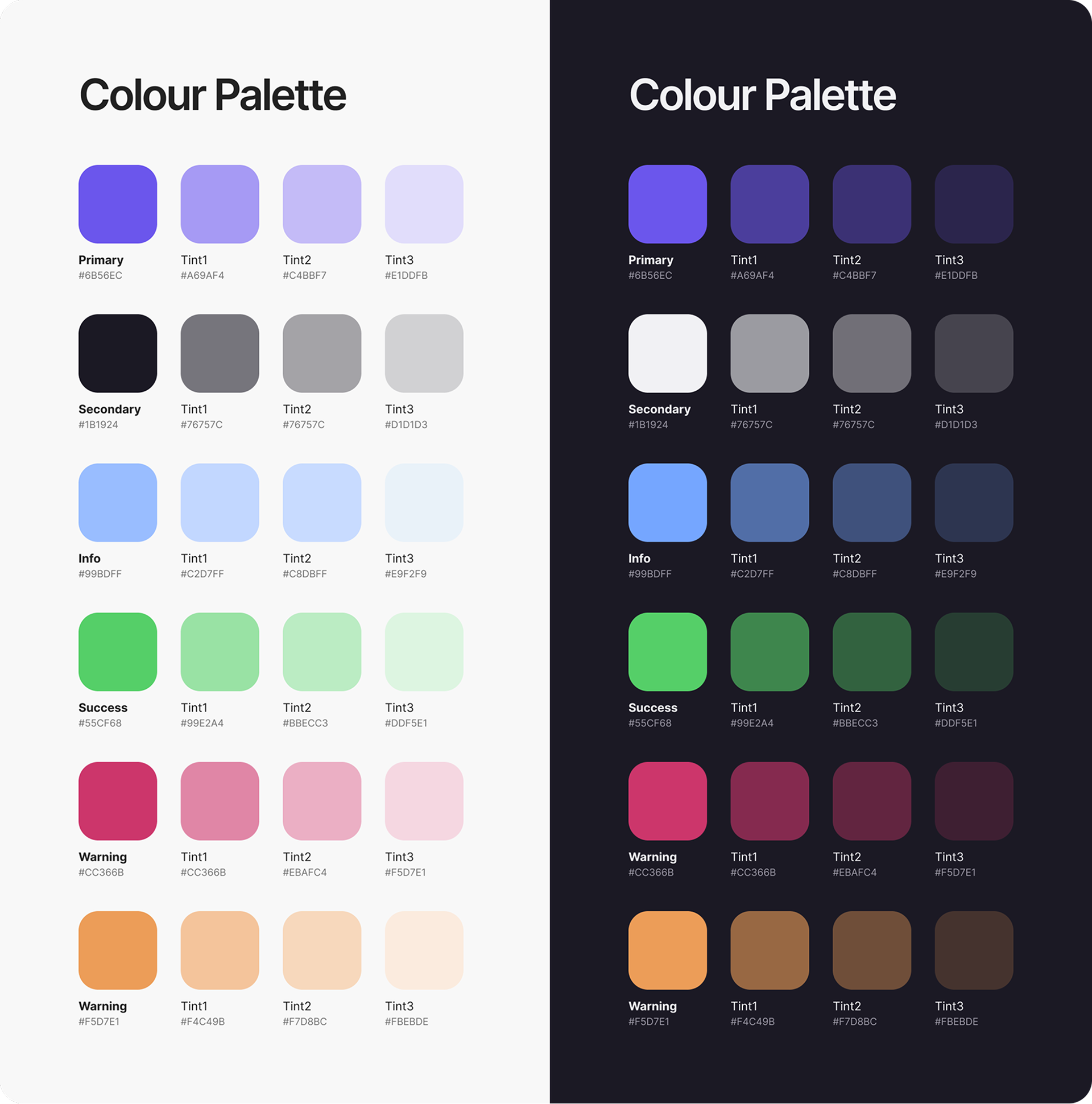
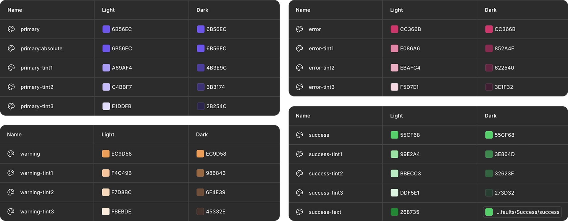
Colour
A tech-adjacent palette set has been selected to look great on screens and shine in dark mode.

Spacing
Spacing is set up as variables at 4pt, 8pt, and 24pt increments. I have used a px/pt based naming convention so I don’t have to do any mental conversion (e.g. 100 = 1REM = 16pt). It’s easy enough to rename the spacing variables to suit any naming convention.


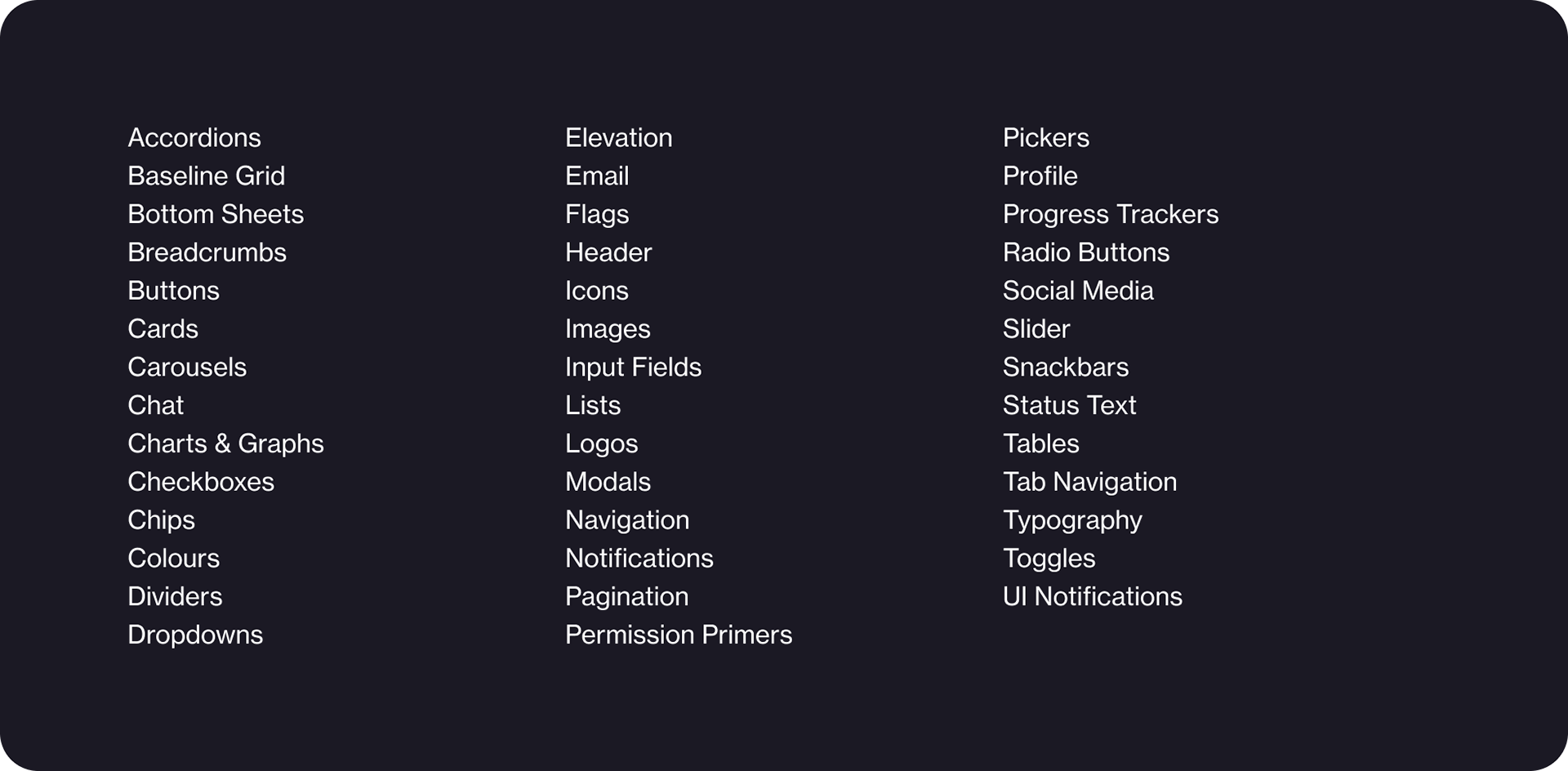
UI Kit
The UI kit of the design system contains all of the main elements and configurations needed to build a mobile application.
All components feature easy to use properties for quick adjustments, with various colour, dimension and spacing settings stored as variables.
All components feature easy to use properties for quick adjustments, with various colour, dimension and spacing settings stored as variables.

UI KIT EXAMPLE
Icons
Simple, clean icons designed in Illustrator with keyline guides.
Simple icons are the easiest to parse on small devices so these designs are in line with user’s existing mental models.
Simple icons are the easiest to parse on small devices so these designs are in line with user’s existing mental models.
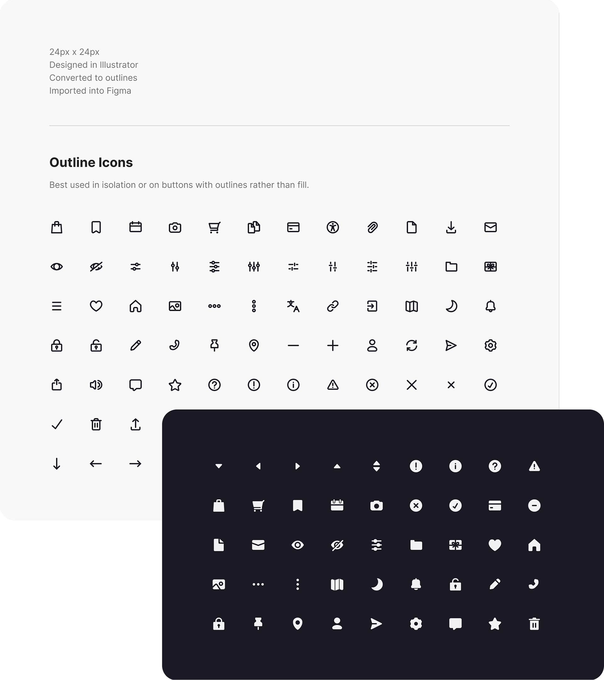

UI KIT EXAMPLE
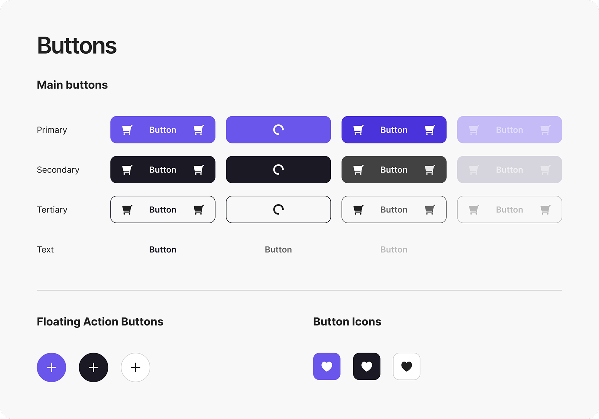
Buttons
A simple yet versatile button setup allows for various layouts that include or exclude icons. Colours are defined as variables and linked from default colour tokens.

Variables and Tokens
My goal with this system was to make it easy to make global changes without having to go in to each component manually.

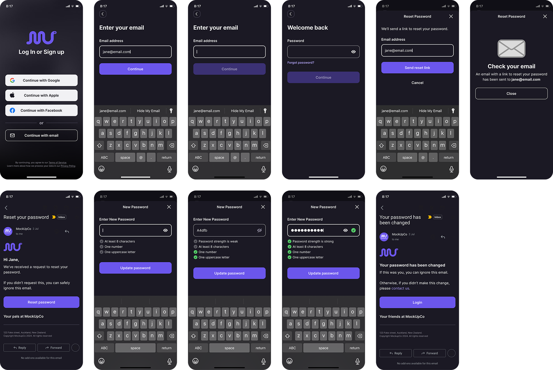
Patterns
Pattern prototypes include user flows for typical situations such as resetting your password and creating an account. These prototypes make use of the UI kit to build the pages and interfaces.