
Roles
UX/UI Design
Prototyping (lo-fi & hi-fi)
User Testing
Affinity mapping
UX/UI Design
Prototyping (lo-fi & hi-fi)
User Testing
Affinity mapping

The problem
The Liquorland project had a tricky problem to solve: all orders had to be shipped from one single store, yet not all stock on the website was stocked in every store.
On other websites with a similar problem, the websites tended to do one of the following:
On other websites with a similar problem, the websites tended to do one of the following:
1) Defaulted the user to a store without their knowledge
2) Showed a limited range of products until a store was chosen

In both instances, websites limited the product range, which gave the impression that there was less product available online. I knew that part of the solution to this problem was to expose the entire range of products when first entering the website, and to not auto-assign the user to a particular store.
User testing was required to validate assumptions about what the initial user journey should look like.
User testing was required to validate assumptions about what the initial user journey should look like.

Learning Goal 1:
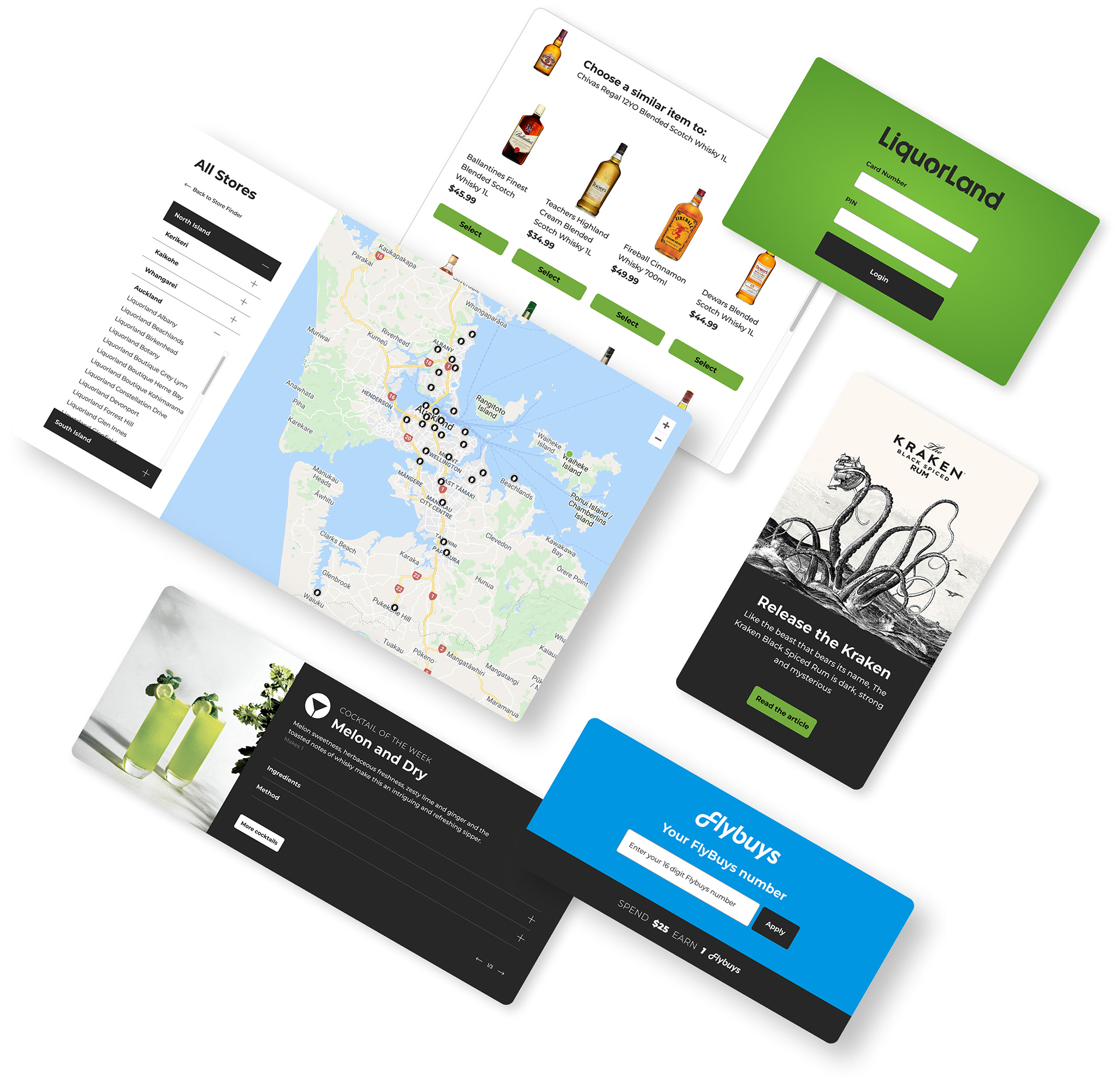
Store selection
Store selection
I wanted to see how users would respond when forcing them to choose a store before they could add an item to their cart.

A: Force a user to select a store
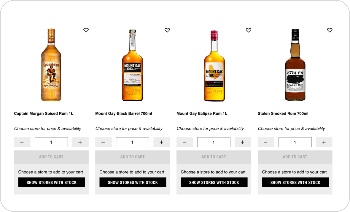
The problem with this wireframe prototype was that users made the assumption that everything on the site was out of stock, due to the ‘add to cart’ button being greyed out.
The problem with this wireframe prototype was that users made the assumption that everything on the site was out of stock, due to the ‘add to cart’ button being greyed out.
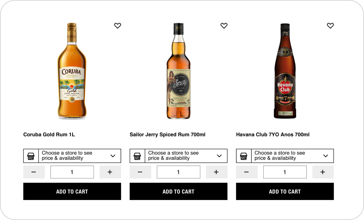
B: Defer store selection until later
It seems obvious now, but no user would select ‘add to cart’ if there is no price showing. And some users completely missed the ‘choose a store to see price & availability’ button, reminding me that button text always needs to be a minimal length for easy scanning.
It seems obvious now, but no user would select ‘add to cart’ if there is no price showing. And some users completely missed the ‘choose a store to see price & availability’ button, reminding me that button text always needs to be a minimal length for easy scanning.

Learning Goal 2:
Geolocation
Geolocation
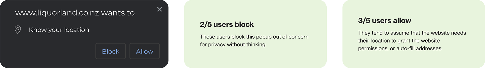
I wanted to gauge how users felt about browsers wanting to know their location.


Learning Goal 3:
Product Range
Product Range
Did users want access to the entire product range?
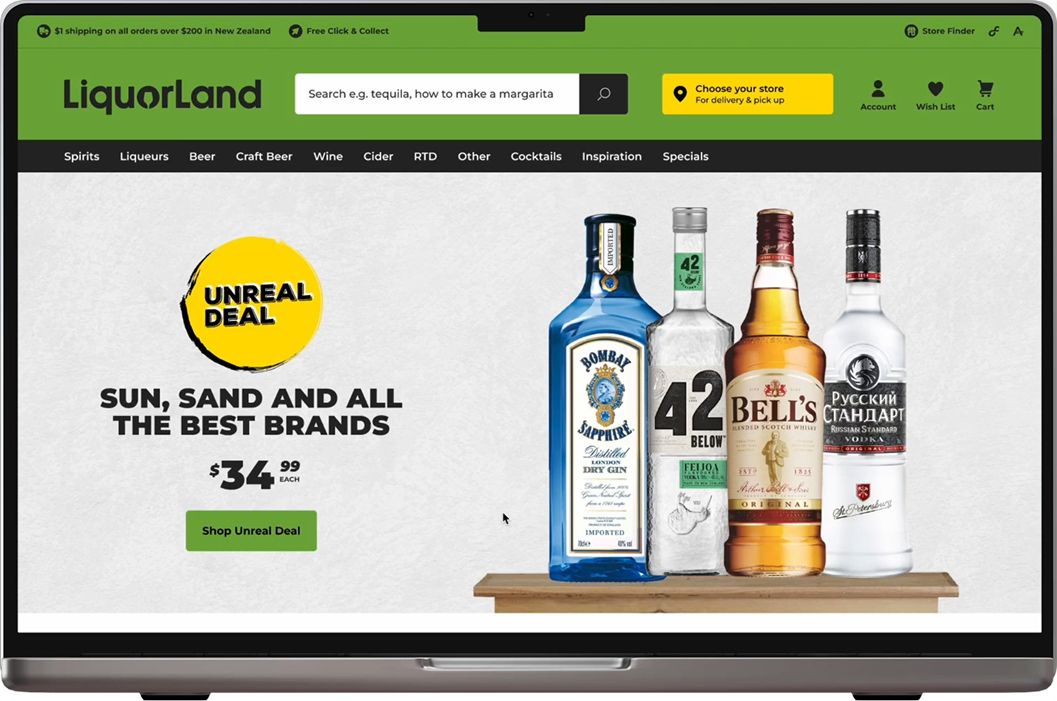
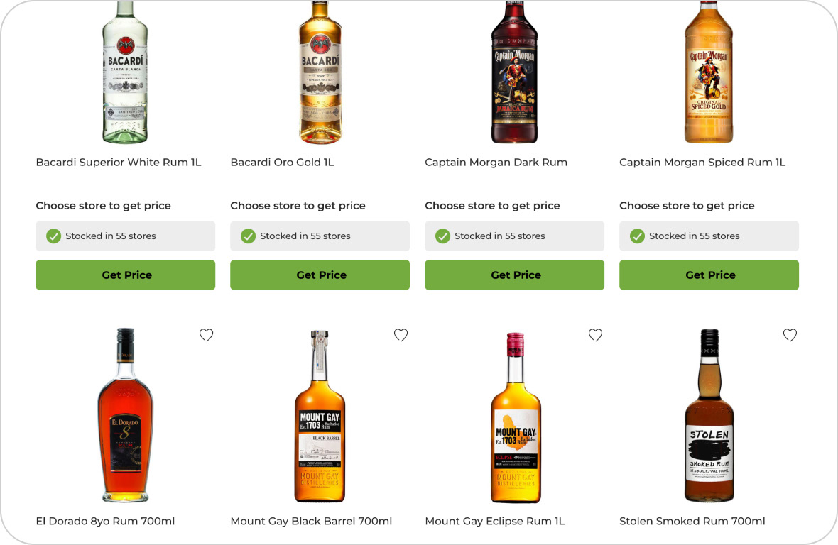
Having the entire product range available on first visit appealed to most users, but some only wanted to see stock from their selected store. So giving the users a ‘show in-stock items only’ option was essential to cater to both cases.

Solutions


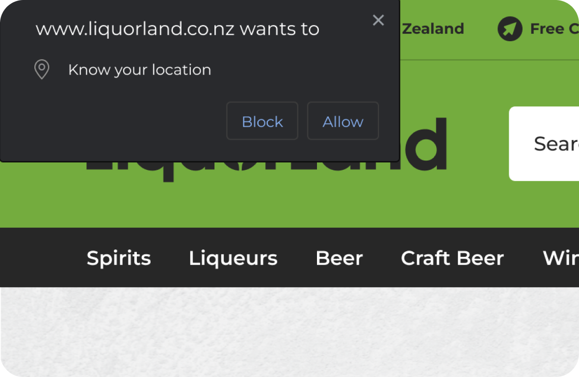
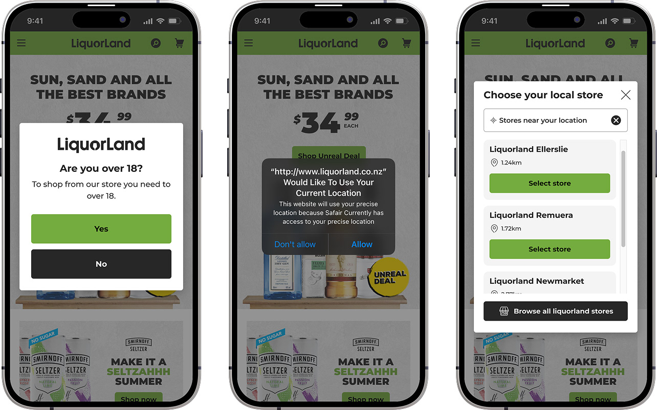
Geolocation
Users were somewhat comfortable with the ‘browser wants to know your location’ popup so I knew this could be used in the user journey.
Users were somewhat comfortable with the ‘browser wants to know your location’ popup so I knew this could be used in the user journey.
How to prompt the user to choose a store?
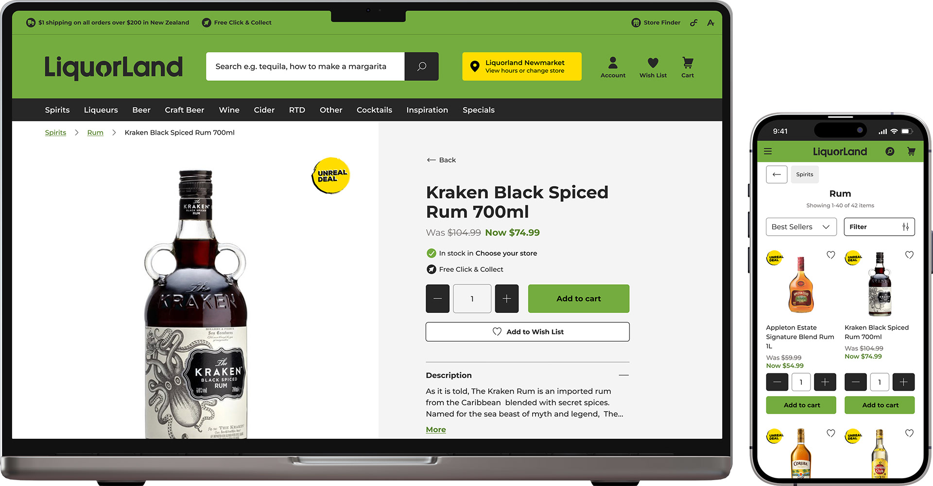
From the user testing I learned that users need to see a price for a product before adding it to their cart. I opted to use the text ‘get price’ in place of the ‘add to cart’ button, which will bring up the modal ‘choose store to get price’. This solution covers both the user goal, seeing price before purchasing, and the business goal, fulfil an order from one store per order.
From the user testing I learned that users need to see a price for a product before adding it to their cart. I opted to use the text ‘get price’ in place of the ‘add to cart’ button, which will bring up the modal ‘choose store to get price’. This solution covers both the user goal, seeing price before purchasing, and the business goal, fulfil an order from one store per order.
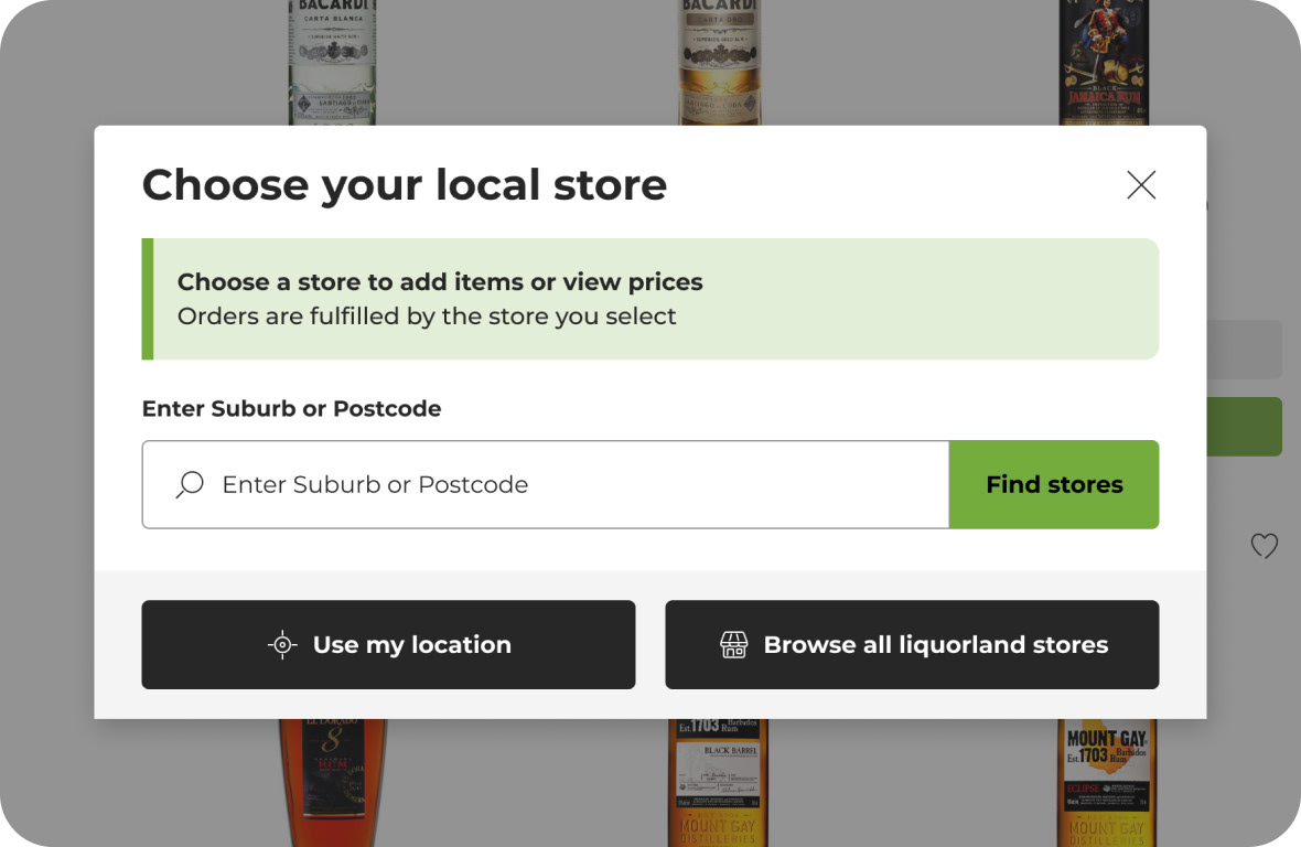
“Get Price” modal
The ‘get price’ modal gives the user a few different options for assigning their store.
The ‘get price’ modal gives the user a few different options for assigning their store.
• Search using suburb and postcode
• Detect my location (geolocation - allow website to know your location)
• Browse stores - select store from an interface
• Detect my location (geolocation - allow website to know your location)
• Browse stores - select store from an interface
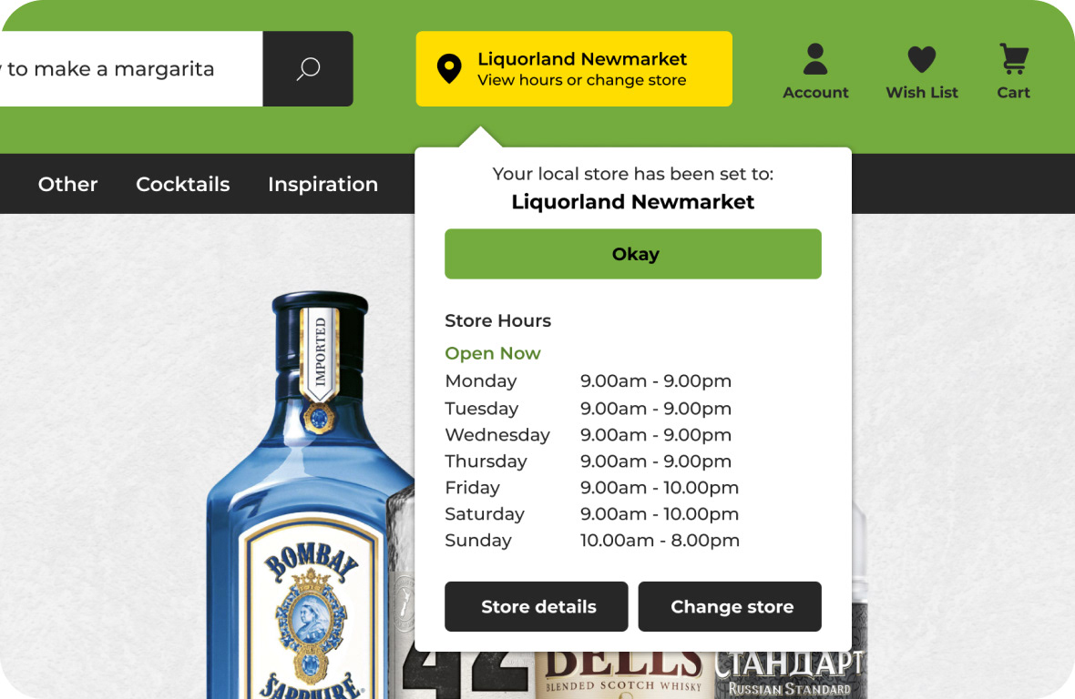
Store selection in header
Users also have the tried and true option of selecting their store from the header. In testing, they intuitively looked in the top right region of the header.
Users also have the tried and true option of selecting their store from the header. In testing, they intuitively looked in the top right region of the header.
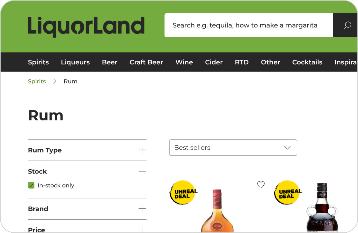
Product range
This solution was fairly straightforward: expose the entire product range but allow the user to show only in-stock products for their currently selected store.
This solution was fairly straightforward: expose the entire product range but allow the user to show only in-stock products for their currently selected store.

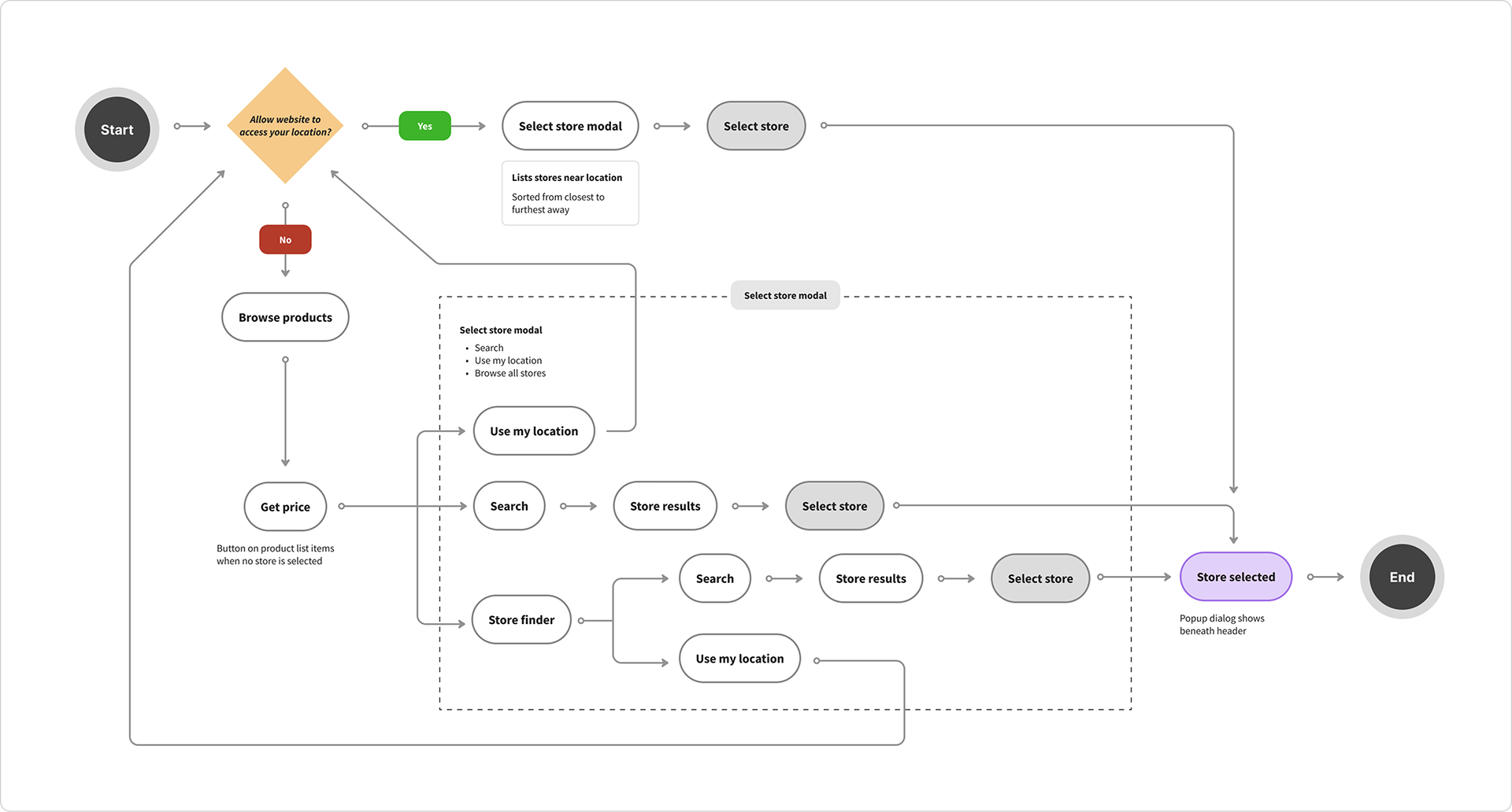
User Flow — Get Price


Additional sections


Final Thoughts
This was a good foray into user testing to validate a problem. At the time I was happy with the ‘get price’ button as a middle ground to get the user to choose a store if they have blocked the site from knowing their location, but perhaps there is some better wording. What would the user’s expectation be after pressing the get price button? Would they expect pricing per store to show? It’s a hard problem to solve, and I feel more user testing would help here.